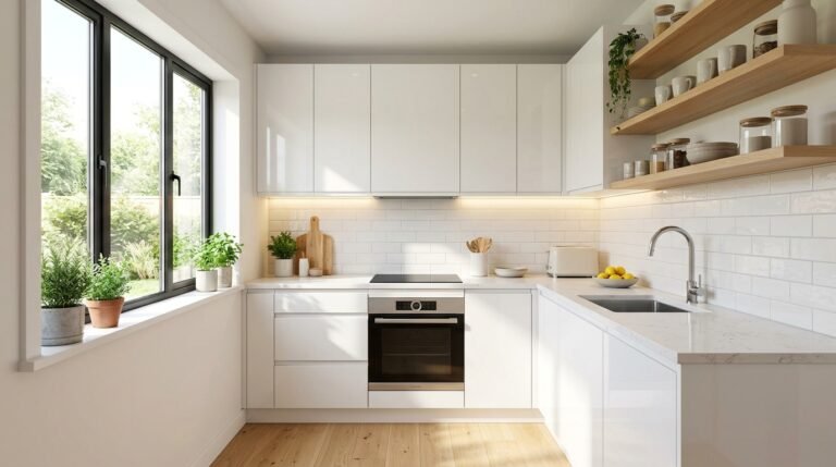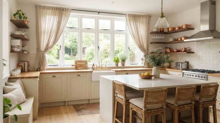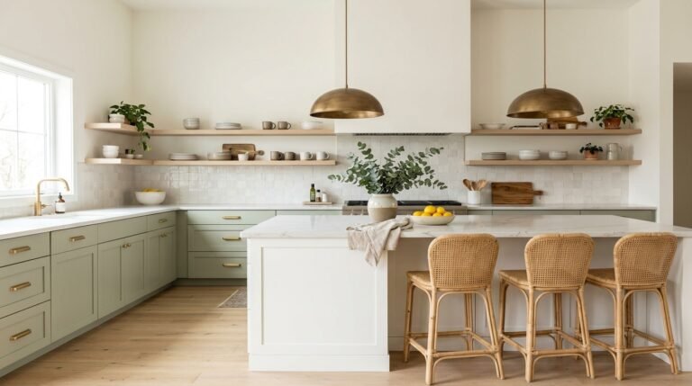
Tired of white kitchens that feel flat and forgettable? Imagine opening your kitchen door each morning to a color that makes you smile. Colored kitchen cabinets are the easiest way to give your space personality, warmth, and a custom look without changing the layout. In this guide, you’ll find 19 inspiring ideas, from calming sage and rich navy to playful mint and moody burgundy. I’ve noticed that most people don’t struggle with wanting color. They struggle with choosing the right shade, finish, and hardware to go with it. That’s exactly what each idea below solves, with simple styling tips, pairing suggestions, and practical notes from real homes. Scroll through, save your favorites, and get ready to find the one that finally feels like yours.
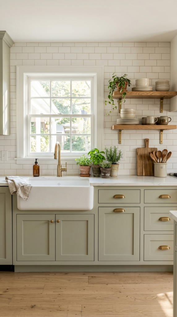
Sage Green Cabinets
- Adds gentle color without overpowering the room
- Brings a natural, calming feel to busy kitchens
- Pairs easily with white, wood, and brass finishes
- Works well for first-time color users who want a safe start
Want color that feels calm instead of loud? Sage green is the answer. This soft, earthy shade brings the outdoors into your kitchen without overwhelming the room. It works beautifully with white counters, warm wood, and brass hardware, so nothing feels forced. Because sage has gray undertones, it stays gentle in both bright and dim light. Paint the cabinet doors in a satin finish for easy cleaning, and keep the walls creamy white. The result is a kitchen that feels fresh, relaxed, and welcoming from the first morning coffee to the last evening dish.
In my experience, sage green is the easiest first step for anyone nervous about color. I’ve noticed that it pairs well with almost every countertop, from marble to butcher block. Before committing, tape a large paint sample on the cabinet and watch it for two days, since sage can lean greener in warm light. Add simple knobs in aged brass or matte black, and bring in linen towels and a few herbs on the windowsill. These small touches make the whole room feel layered, natural, and thoughtfully put together without any major renovation or expensive materials.
Navy Lower Cabinets
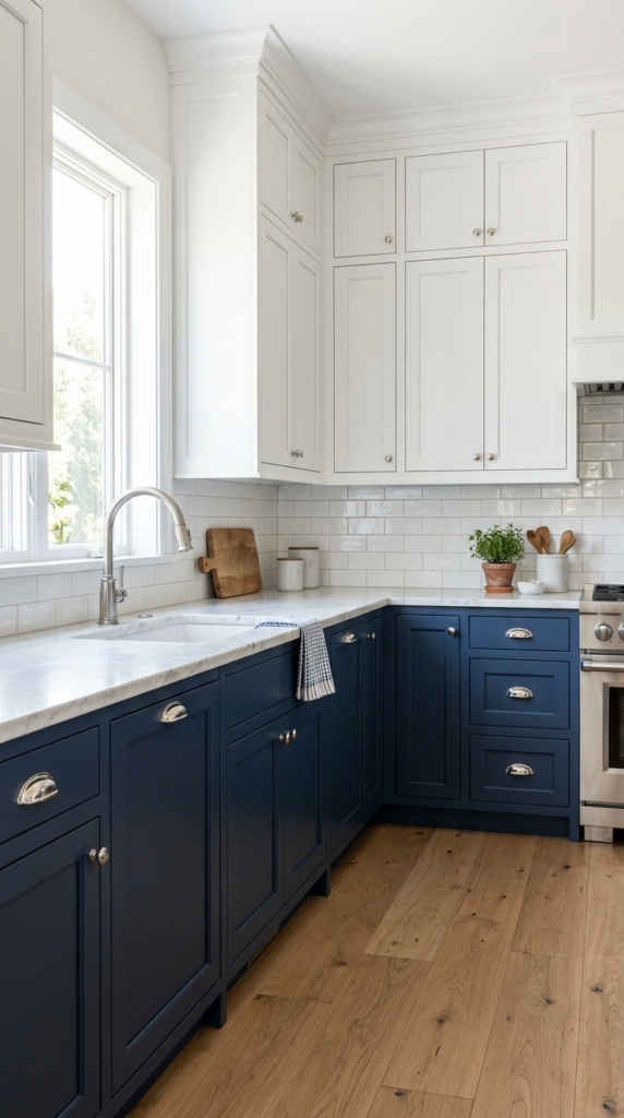
- Grounds the kitchen with a deep, rich base color
- Keeps the upper half light, open, and airy
- Hides scuffs, splashes, and fingerprints better than pale paint
- Gives a custom, tailored look with just one color change
Two tones, double the style. Painting only the lower cabinets navy gives your kitchen weight and warmth while the white uppers keep everything light. The dark base grounds the room, hides scuffs from daily use, and makes a white countertop look even brighter. It’s a smart choice for kitchens with limited natural light, because the pale upper half bounces brightness around. Choose polished nickel or brushed brass pulls for a refined contrast. The finished look feels classic, tailored, and balanced, as if the cabinetry was designed with a clear plan from the start, even in a builder-grade layout.
I’ve seen this work well in many homes, especially family kitchens where the lower cabinets take the most abuse. Navy hides fingerprints, splashes, and scuff marks far better than pale paint. Use a durable cabinet enamel and let it cure fully, which usually takes a couple of weeks before heavy use. Keep the upper cabinets in a warm white, not a stark one, so the contrast looks soft instead of harsh. Add a runner rug in a neutral pattern and simple glass pendants for finishing touches. The overall effect is polished, practical, and easy to live with every day.
Warm Terracotta Cabinets
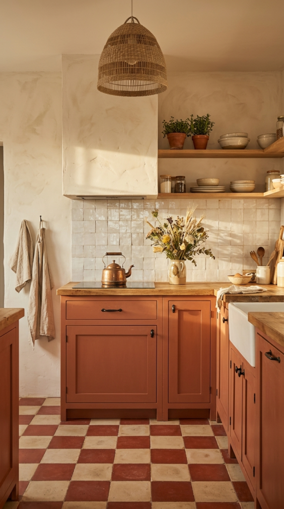
- Wraps a cold or plain kitchen in instant warmth
- Adds a handmade, sun-baked Mediterranean feel
- Looks stunning with wood, cream, and black iron accents
- Creates a cozy mood that feels collected, not staged
Ready to add some warmth? Terracotta cabinets wrap a kitchen in a gentle, sun-baked glow that feels instantly lived in. This earthy orange-brown shade works wonders in rooms that feel cold or overly modern. It pairs naturally with cream walls, wood counters, and black or iron hardware. Because the tone is rich yet soft, it never feels flashy. Choose a matte or eggshell finish to highlight the depth of the color. The result is a cozy, welcoming kitchen with a handmade, Mediterranean mood that makes even a quick breakfast feel like a small, special occasion.
That’s why many designers recommend terracotta for open, sunlit kitchens, where the color glows beautifully. In smaller or darker rooms, I’d suggest using it on the lower cabinets only, so the space doesn’t feel heavy. Test the shade in your own light first, since terracotta can shift from peachy to deep brown. Add a patterned tile floor, woven baskets, and a few green plants to balance the warmth. Each layer adds texture and personality, and the kitchen starts to feel collected over time. It is a bold choice, but one that rewards you daily with comfort and character.
Blush Pink Cabinets
- Adds a soft glow that acts almost like a neutral
- Brightens dim rooms and makes small kitchens feel open
- Pairs beautifully with gold, marble, and dark wood
- Feels modern and stylish, never childish
Think pink is too sweet? Think again. Blush cabinets bring a soft, rosy warmth that feels modern, not childish. The shade acts almost like a neutral, glowing gently against white marble, brass hardware, and walnut wood. It brightens dim rooms and flatters everything around it, including your food and your skin. Choose a dusty, slightly muted blush with beige undertones so it stays sophisticated. Satin paint works well on cabinet doors and wipes clean easily. Keep the walls warm white, and the space feels light, romantic, and welcoming. It is a gentle way to add personality without losing elegance.
I’ve noticed that blush works best when paired with something grounding. Black fixtures, dark wood, or a deep green plant stop the pink from feeling too sugary. Before painting, compare swatches against your countertop, because some pinks turn salmon beside warm stone. Add slim gold pulls, a simple runner, and fresh flowers on the counter for an effortless finish. In small kitchens, this color makes the walls seem further away, which adds a sense of openness. The overall look is soft, stylish, and cheerful, giving everyday cooking a lovely lift that guests always comment on.

please also read:18 blue kitchen
Forest Green Island
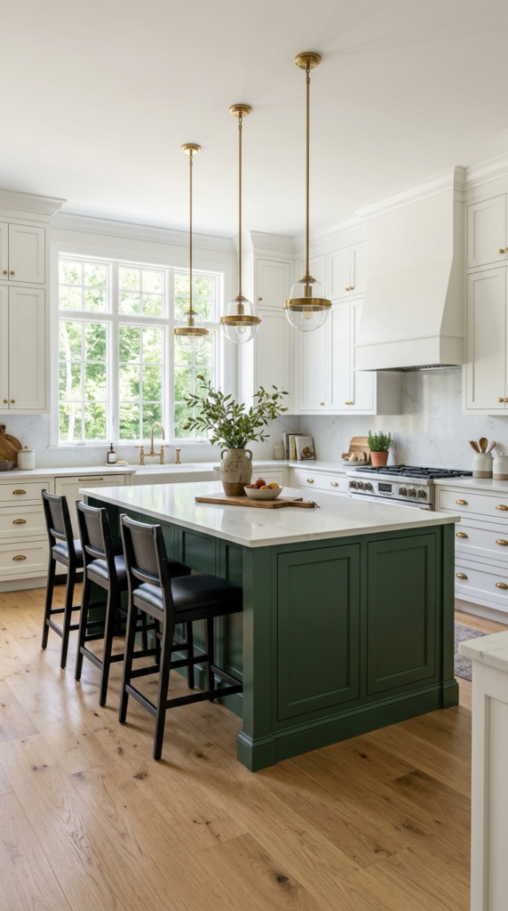
- Creates a rich focal point without painting every cabinet
- Connects the kitchen to the outdoors with a natural shade
- Looks stunning with brass, oak, and white stone
- Feels timeless, so it won’t go out of style quickly
Give your island a rich, leafy makeover. Forest green is deep, calm, and wonderfully timeless, so it never feels like a passing trend. Painted on the island alone, it becomes a striking centerpiece while the surrounding cabinets stay light and neutral. The color looks stunning with brass lighting, white quartz, and warm oak stools. It also connects the room to the outdoors, especially when a window shows trees or garden. Choose a finish with a gentle sheen so the green looks velvety yet stays easy to wipe. Many homeowners say this shade makes cooking feel more relaxed and grounded.
In my experience, deep green needs good lighting to shine. Without enough light, it can read almost black, so add warm pendants and a bulb around 2700K to bring out its richness. Pair it with natural materials like oak, rattan, and stone for balance. I’ve seen this work well in open-plan homes, where the island faces the living area and acts as a quiet statement piece. Keep hardware simple, such as aged brass bar pulls. The final look feels sophisticated, inviting, and rooted in nature, and it gives the whole kitchen a calm, confident personality.
Buttery Yellow Cabinets
- Lifts the mood of dark or north-facing kitchens
- Creates a warm, vintage cottage feel
- Pairs well with white, black, and touches of blue
- Feels cheerful without being too bright
Sunshine you can paint on. Buttery yellow cabinets make a kitchen feel happy before the kettle even boils. The shade is soft rather than bright, so it feels creamy, cozy, and slightly vintage. It brightens north-facing rooms that lack daylight and lifts moods on grey mornings. Pair it with white counters, black cup pulls, and touches of blue for a fresh cottage look. Pick a muted, creamy tone instead of lemon, which can feel harsh on large surfaces. The result is a warm, cheerful kitchen that welcomes everyone who walks in with an instant smile.
If you love colored kitchen cabinets but fear them, yellow is friendlier than it looks. I’ve noticed that people often hesitate, then adore it once the doors are up. Choose a shade with a touch of cream or beige, and check it beside your flooring, since yellow can clash with orange wood. Glass-front uppers filled with white dishes keep the look airy. Add a woven rug, linen curtains, and a bunch of daisies on the counter. These simple layers turn a plain space into a sunny, storybook corner that feels personal, relaxed, and delightfully welcoming.
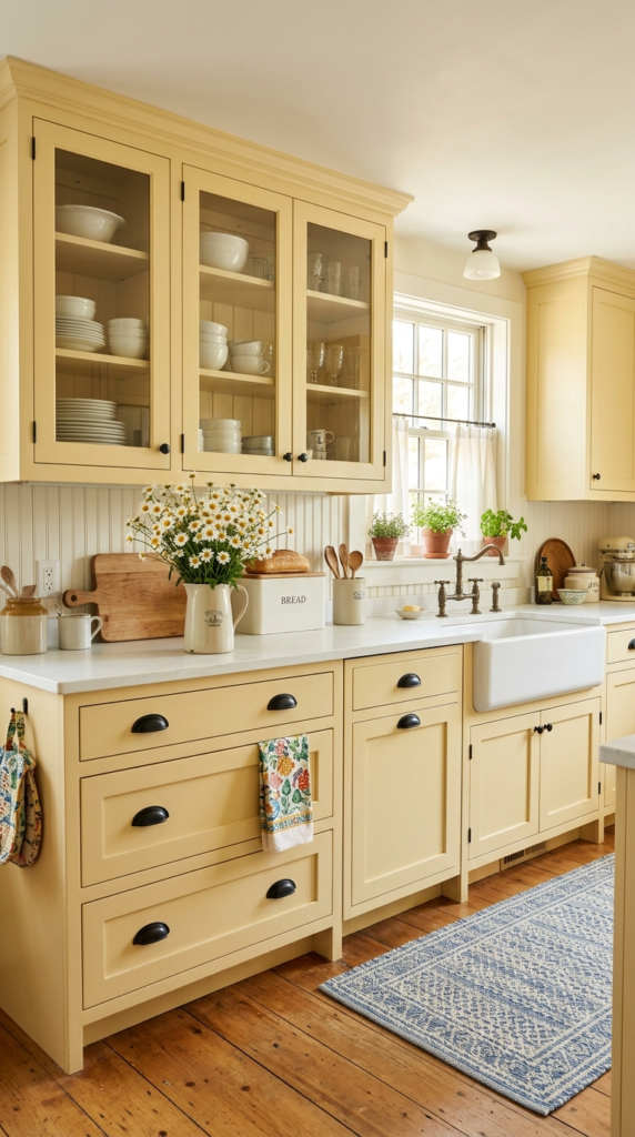
Blush Pink Cabinets
- Adds a soft, warm color that reads almost like a neutral
- Looks elegant with champagne gold, brass, and white marble
- Brightens compact kitchens by bouncing daylight around
- Feels fresh and modern when paired with greenery
Think pink is too sweet for a real kitchen? Think again. Blush cabinets read as a soft neutral once they’re on the wall, especially in dusty, muted tones that lean slightly beige. They bounce daylight around the room and flatter everything nearby, from white marble to warm wood. I’ve noticed that clients who try blush often say it feels calmer than they expected, almost like a warm cream with extra personality. Add champagne gold hardware and simple white walls, and the look turns sophisticated instead of childish, giving even a compact kitchen a polished, designer-style glow that guests remember.
Ready to try it? Start with a dusty, slightly warm blush rather than a bubblegum shade, and test it beside your countertops before committing. Matte or eggshell finishes look the most elegant. Pair the doors with brass or champagne pulls, white tile, and a few green plants, which keep the palette fresh and balanced. The visual payoff is a kitchen that feels soft, welcoming, and quietly luxurious. If you worry about trends, balance the pink with natural wood stools and a neutral rug, so the room still feels grounded and easy to live with for years.
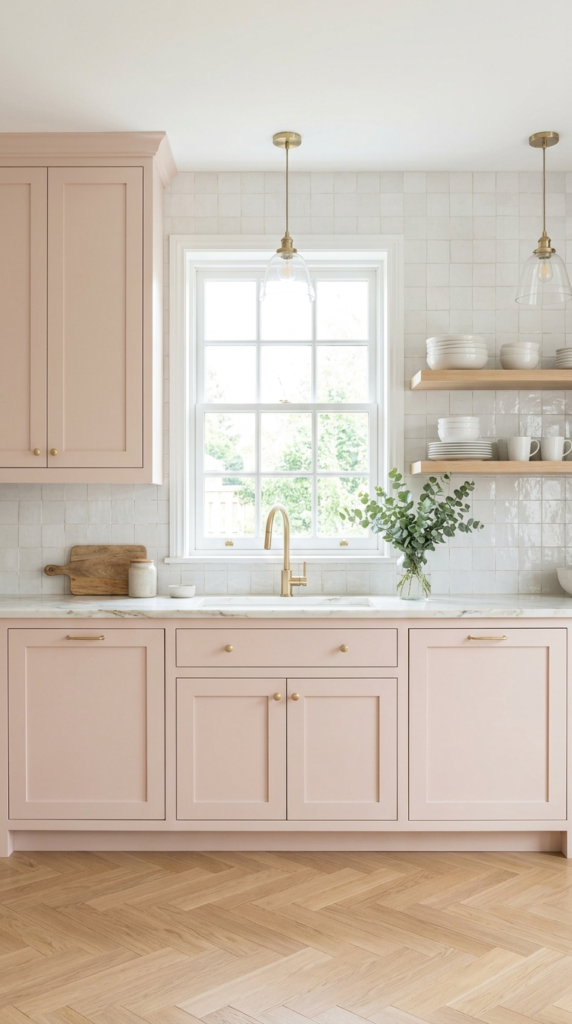
Butter Yellow Cabinets
- Brings a sunny, happy feel, even on gray mornings
- Softer and more livable than bright lemon or mustard
- Looks great with white, cream, and light wood
- Makes small kitchens feel brighter and bigger
Meet the cabinet color that feels like morning sunshine. Butter yellow is soft, creamy, and surprisingly easy to live with, because it sits close to off-white while still giving the room a clear personality. It lifts dull corners, brightens windowless spaces, and makes even simple flat-panel doors look fresh and intentional. In my experience, the trick is choosing a pale, slightly warm tone instead of a sharp lemon. That gentle softness keeps the color cheerful without tiring your eyes, and it blends beautifully with white countertops, natural wood, and matte black hardware for a modern cottage mood.
Want to try it without a full renovation? Paint the lower cabinets or just the island first, then see how the color feels in different light. Keep the walls white or warm cream so the yellow stays the star. Add rattan stools, a checkered floor, or simple ceramic jars to build that relaxed cottage charm. The result is a kitchen that feels open, friendly, and welcoming the moment you walk in. Because the shade is pale, small scratches and dust blend in nicely, which makes upkeep easier than darker, high-contrast cabinet colors.
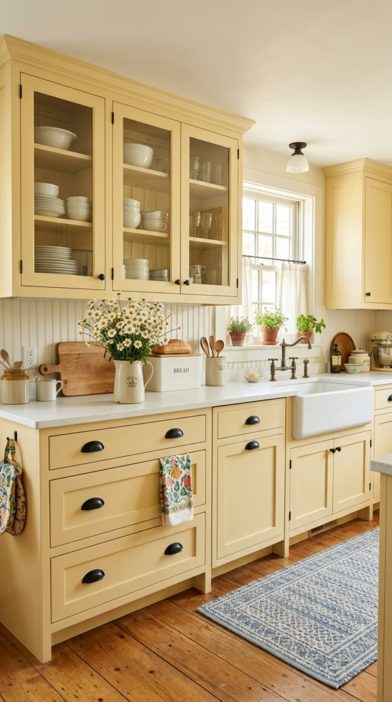
Forest Green Cabinets
- Creates a cozy, rich look that feels timeless
- Pairs perfectly with brass, copper, and warm wood
- Hides stains and wear on busy cooking days
- Works well with both traditional and modern layouts
Deep, rich, and endlessly cozy, forest green turns a plain kitchen into a room people want to linger in. This shade carries the calm of a woodland walk, yet it feels sophisticated enough for formal dinners. I’ve seen this work well in homes with older charm, where the color highlights moldings, paneled doors, and vintage lighting. Against cream tile and antique brass, it glows like an old library. It also hides splashes, fingerprints, and daily wear better than pale cabinets, which makes it a smart, practical choice for families who actually cook every night.
To keep a dark green kitchen from feeling heavy, layer in light. Choose warm white or cream for the walls, add a pale backsplash, and install plenty of under-cabinet lighting so the color glows after sunset. Antique brass pulls and a walnut shelf bring warmth, while a patterned runner softens the floor. The final look feels grounded, elegant, and welcoming, like a space with history. If your room gets little daylight, pick a green with a hint of blue or gray, which stays lively instead of turning muddy in shadowy corners.

Two Tone Cabinets
- Adds color while keeping the room bright and open
- Draws the eye to the island or lower cabinets
- Lets you try bold shades without going all in
- Makes standard kitchens look custom-designed
Can’t pick just one color? Don’t. Two-tone cabinets give you the best of both worlds, pairing a darker shade below with a lighter one above. This simple trick adds depth, keeps ceilings looking tall, and stops a bold color from taking over the room. I’ve noticed that it also helps balance kitchens with limited natural light, because the pale uppers reflect brightness while the darker base adds grounding weight. Popular combinations include dusty blue with white, green with cream, and charcoal with soft gray, each creating a layered, custom look that feels thoughtful rather than random.
Getting the balance right is easy with one rule: keep the darker color low and the lighter color high. Match your hardware across both tones, such as matte black or brushed brass, so the design feels connected. Choose a simple backsplash and a neutral countertop to avoid visual clutter. The result is a polished kitchen that feels bright at eye level and rich near the floor. It’s also a budget-friendly update, since you can repaint only the lower cabinets and still achieve a dramatic, designer-level transformation that changes the whole room.
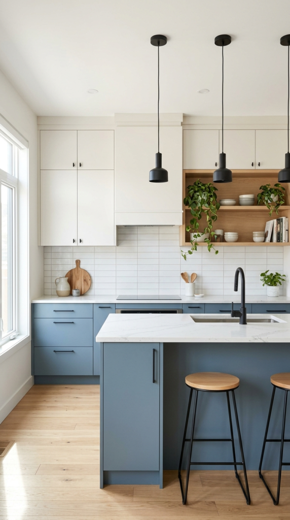
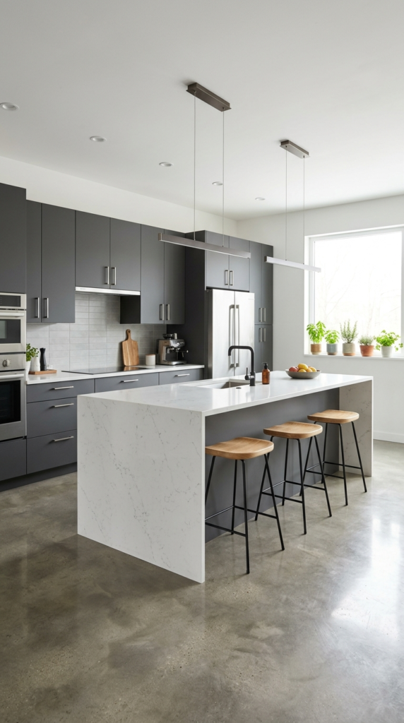
Charcoal Gray Cabinets
- Gives a sleek, modern look that never feels too trendy
- Pairs well with stainless steel and white stone
- Matte finish hides dirt, grease, and fingerprints well
- Acts as a strong neutral for adding colorful decor
Charcoal gray proves that a neutral can still make a statement. It’s deeper than standard gray, softer than black, and incredibly flexible for modern homes. The shade gives flat-panel doors a sleek, architectural feel, while stainless steel appliances and white stone surfaces look sharper beside it. In my experience, charcoal works especially well in open-plan homes, where the kitchen needs to look polished from the living room. It also acts as a calm backdrop for colorful decor, so you can change towels, art, and plants whenever you feel like refreshing the space.
To keep charcoal cabinets from feeling cold, add warmth through materials. Light oak stools, a wood cutting board, and warm white walls soften the look instantly. Choose a matte finish for a modern feel, and pick brushed nickel or black pulls for a clean line. Good lighting matters here, so add under-cabinet strips and bright pendants. The finished kitchen feels confident, calm, and effortlessly current, with enough contrast to look dramatic yet enough neutrality to stay timeless. It’s a smart pick if you want color depth without committing to a bold hue.
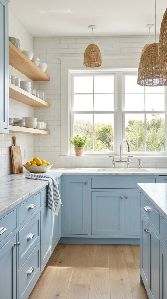
Powder Blue Cabinets
- Feels light, clean, and airy, like a sea breeze
- Pairs nicely with white marble, chrome, and woven textures
- Makes small kitchens look larger and brighter
- Suits both coastal and classic farmhouse styles
Fresh as a summer sky, powder blue brings instant calm to a busy kitchen. This pale, gentle shade works like a soft neutral with a cool twist, so it feels relaxing rather than loud. I’ve seen this work well in smaller kitchens, where lighter colors help walls seem to step back and the space feels larger. Combined with white marble, glossy subway tile, and chrome fixtures, it creates a clean, breezy mood that suits coastal homes and classic farmhouses equally well. Even on cloudy days, the cabinets keep the room looking bright, cheerful, and refreshingly tidy.
Styling powder blue is refreshingly simple. Keep countertops white or light gray, choose chrome or polished nickel hardware, and add natural texture with rattan baskets or woven pendant lights. A glossy backsplash reflects daylight and makes the blue look even brighter. For a more modern feel, try flat-panel doors in a satin finish, or keep shaker doors for a traditional cottage look. The result is a kitchen that feels light, welcoming, and organized. Before painting, test the shade in your own lighting, because blue can lean gray in shade and sparkle in direct sun.
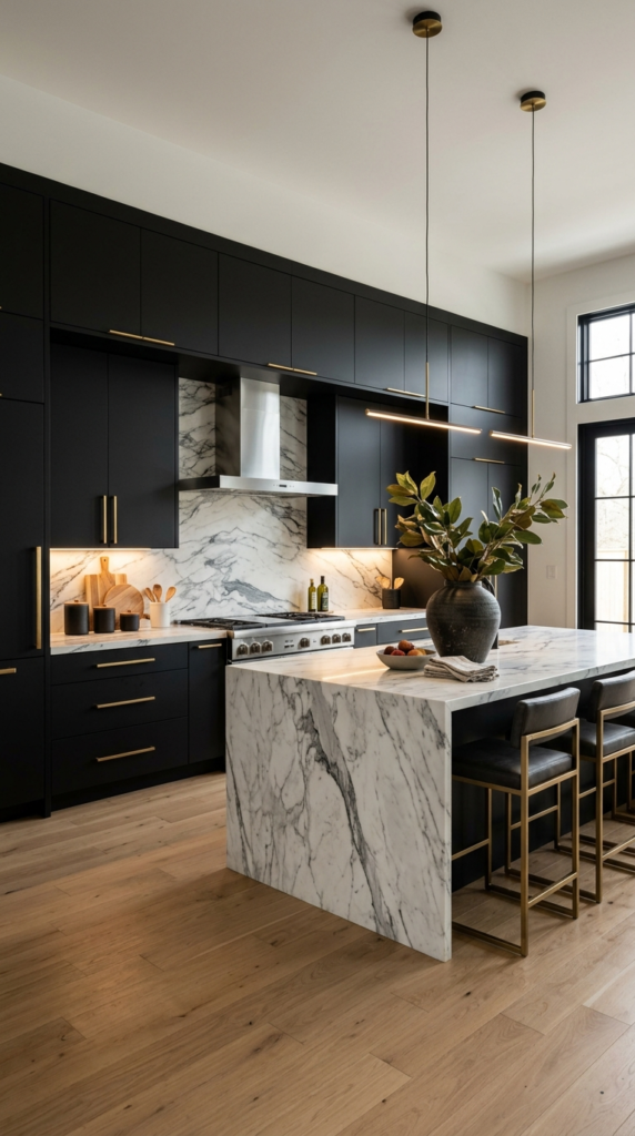
Matte Black Cabinets
- Creates a bold, high-end look that stands out
- Gives white marble and brass a stunning contrast
- Matte finish looks softer and shows fewer fingerprints than gloss
- Works best with good lighting and light floors
Bold, moody, and undeniably chic, black cabinets are the showstopper of modern kitchens. Many people worry that black will shrink the room, but when it’s used with light floors, bright lighting, and reflective surfaces, it adds depth instead of heaviness. That’s why many designers recommend a matte finish, which absorbs glare and feels velvety. Pair the doors with veined marble and warm brass hardware, and the contrast looks luxurious in photos and in person. The kitchen instantly gains a custom, gallery-like quality that makes simple everyday cooking feel a little more special.
If you’re nervous, start small. Try black on the island or lower cabinets, then keep the uppers white or choose open shelving. Make sure you have layered lighting, including pendants, under-cabinet strips, and a bright window, so the doors never look flat. Add warmth with wood stools, a jute runner, and fresh greenery. The final result feels sharp, dramatic, and surprisingly balanced. Since matte black can show dust and chalky marks, keep a soft microfiber cloth nearby and wipe gently, which keeps the finish looking rich and even without harsh cleaners.
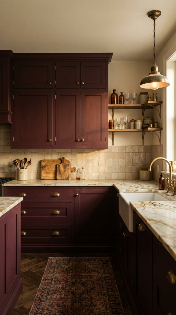
Burgundy Cabinets
- Adds a bold, wine-inspired richness that feels special
- Looks gorgeous with brass, cream, and warm wood
- Brings character to traditional or vintage kitchens
- Hides splashes and daily wear well
Imagine a kitchen that feels like a cozy wine bar. Burgundy cabinets deliver exactly that, mixing deep red with a touch of brown for a mood that’s rich, warm, and surprisingly versatile. Unlike bright red, this shade feels mature and settled. It looks especially good in older homes, where it echoes classic furniture, leather chairs, and antique brass. Next to cream countertops and beige tile, the color becomes the star without shouting. It brings a luxurious, old-world personality that makes weeknight dinners and holiday gatherings feel a bit more memorable, inviting, and beautifully intentional.
Keep the rest of the room quiet so the color can shine. Warm white or soft greige walls, cream stone counters, and aged brass hardware create a refined palette that feels balanced. Add a patterned runner or vintage-style pendant for personality. Choose a satin or matte finish, because high gloss can look too intense in deep red tones. The result is a kitchen with depth, warmth, and character that photographs beautifully after sunset. Test a large sample first, since burgundy can shift toward purple or brown depending on your bulbs and window direction throughout the day.
Contrasting Island Color
- Adds a focal point without coloring the whole kitchen
- Easy to repaint later if your taste changes
- Defines the cooking and seating zone clearly
- Great for rentals or budget-friendly updates
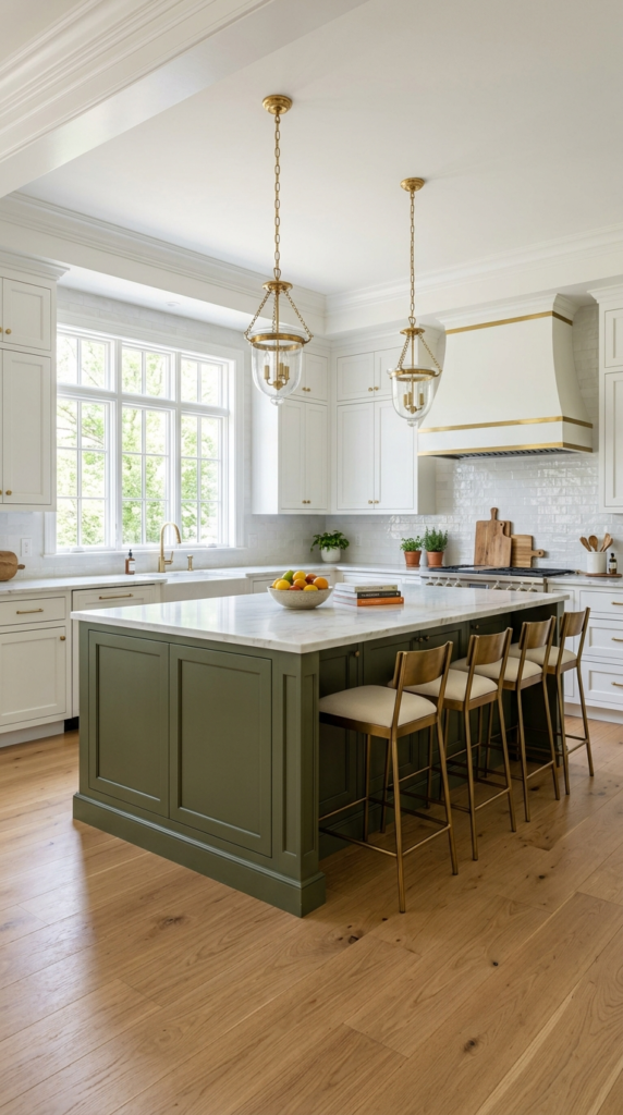
Your island deserves a spotlight. Painting it a different shade from the surrounding cabinets is one of the easiest ways to bring color into a kitchen without committing to a full makeover. It creates a clear focal point, separates the cooking zone from the dining zone, and adds instant depth to an all-white room. In my experience, this idea works wonderfully for homeowners who love color but worry about regret. Olive, deep blue, soft gray, and dusty pink all look gorgeous, especially when the perimeter stays crisp white and the countertops remain simple.
To get it right, match the island color to something already in the room, like a rug, artwork, or window view. Add brass stools, pendant lights, and a few styled accessories to complete the focal point. This approach is a smart way to try colored kitchen cabinets on a smaller scale before painting everything else. The result feels custom, stylish, and balanced, with plenty of personality but no visual overload. If you ever want a change, repainting one island takes a weekend, which makes this idea practical, flexible, and surprisingly affordable.
Warm Taupe Cabinets
- A soft, grounded neutral with more character than white
- Blends smoothly with wood, stone, and linen textures
- Hides smudges and dust easily
- Stays timeless as trends come and go
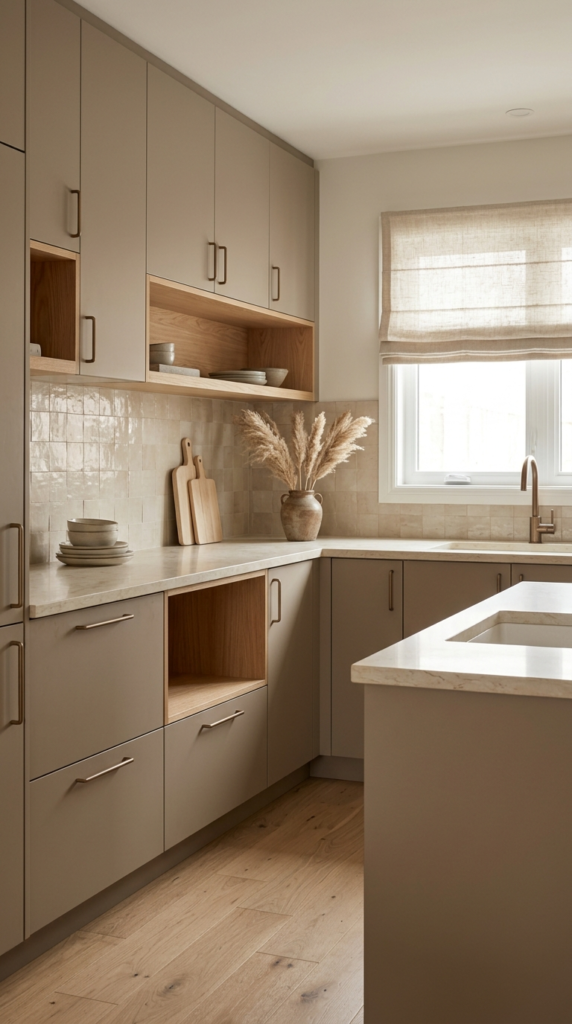
Not every colorful kitchen needs a loud shade. Warm taupe is the quiet hero of modern design, sitting between gray and beige with a soft, earthy glow. It gives cabinets presence without demanding attention, which makes it ideal for calm, minimalist homes. It shines in open spaces, where the kitchen flows into a living area and the color needs to feel natural beside sofas, rugs, and wood furniture. It also hides fingerprints, crumbs, and dust more easily than white, so the doors look clean and relaxed even after a busy week.
Layer texture to bring taupe to life. Pair the doors with cream quartz, a beige zellige backsplash, and matte bronze or black hardware for a tonal palette that feels expensive and calm. Add linen shades, wooden bowls, and dried stems to introduce natural warmth. The visual effect is soft but sophisticated, like a boutique hotel kitchen. Choose a satin finish for easy cleaning and a gentle sheen. Because taupe is so adaptable, you can later add bolder accents, from colorful stools to artwork, without repainting a single cabinet door in the future.
Deep Teal Cabinets
- Blends calm blue with energetic green for a unique shade
- Looks stunning with brass, walnut, and white surfaces
- Makes a kitchen feel creative and full of personality
- Pairs well with patterned tile and lively decor
Ready for a kitchen that’s impossible to forget? Deep teal sits between blue and green, creating a jewel-toned shade that feels bold yet surprisingly calming. It brings the energy of peacock feathers and ocean water into a space where you spend hours every day. Teal works best when the rest of the room stays simple, with white counters, light walls, and warm wood. Brass hardware makes the cabinets glow, while patterned tile adds a playful vintage touch. The mood is confident, creative, and very much your own, never copied from a showroom.
Balance is the secret with a color this strong. Choose a warm white or pale gray for the walls, keep countertops light, and let one patterned element, like a cement tile floor or a bold runner, add extra energy. Natural light shows teal at its brightest, while warm bulbs make it feel moodier and richer at night. The result is a lively kitchen with a handcrafted, collected look. If you love colored kitchen cabinets that make a real statement, teal delivers the drama without feeling harsh, cold, or overly serious.

Soft Lavender Cabinets
- Adds a calm, spa-like feel without looking too bold
- Pairs well with white quartz, nickel, and pale wood
- Changes beautifully from silvery to warm through the day
- Gives a small kitchen a soft, unique personality
Here’s a cabinet color that quietly steals every glance. Soft lavender sits between gray and purple, so it feels calming rather than playful, and it looks surprisingly sophisticated in daylight. The shade brings a gentle, spa-like mood into a space that is usually busy and practical. I’ve noticed that people who choose it are often delighted by how it changes through the day, appearing silvery in the morning and warmer at sunset. Beside white quartz and simple subway tile, it feels fresh, romantic, and modern, giving even a small kitchen a delicate personality that guests always comment on.
Styling lavender is easier than it sounds. Choose a grayed, dusty version instead of a bright purple, and keep the countertops white or light gray so the color stays soft. Brushed nickel or pewter hardware looks beautiful, while fresh flowers and pale wood add natural warmth. Select a matte or eggshell finish for a velvety, modern effect. The result is a kitchen that feels peaceful, light, and quietly unique. Before painting, test a large sample near your window, because lavender can lean pink in warm bulbs and blue in cool daylight, and you want to see both.

Retro Mint Cabinets
- Brings a playful vintage charm that still feels current
- Looks great with chrome, white, and checkered floors
- Brightens compact kitchens, even on gray days
- Easy to style with small red or black accents
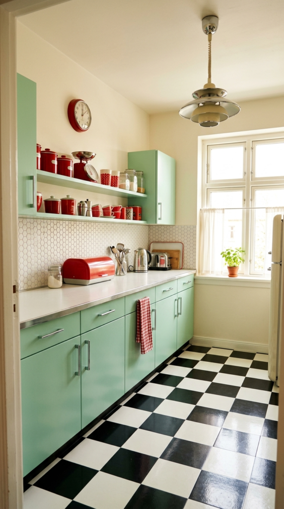
Nostalgia never looked this fresh. Mint green cabinets bring back the cheerful charm of 1950s kitchens, yet today’s softer, slightly muted versions feel completely current. The shade is light, clean, and playful, so it brightens compact rooms and makes everyday cooking feel more joyful. In my experience, mint works best when paired with chrome hardware, white countertops, and a checkered floor, because those classic details strengthen the retro mood without turning the room into a theme park. Even on gray days, the cabinets keep the space looking sunny, lively, and welcoming, which is exactly what a busy family kitchen needs.
Keep the styling simple and let the color do the talking. Choose a soft, grayed mint rather than a neon shade, and pair it with white or cream walls so the palette stays clean. Chrome pulls, a vintage pendant, and a few red or black accents add authentic retro personality. A satin finish is easy to wipe and looks smooth on flat-panel doors. The final look feels cheerful, light, and full of character. Always test a sample beside your appliances first, since mint can clash with cool stainless steel if the undertone leans too blue.
Conclusion
Color has a way of turning a kitchen from merely functional into truly yours. Whether you love calm sage, dramatic navy, or cheerful butter yellow, there’s an idea here for your style and budget. Colored kitchen cabinets don’t have to mean a full renovation. Even a painted island or a two-tone update can change the whole mood. I’ve seen how small changes like these can completely transform a space. So save this post on Pinterest, test a few paint samples, and share it with a friend who’s planning a kitchen refresh. Your dream kitchen starts with one brave color.