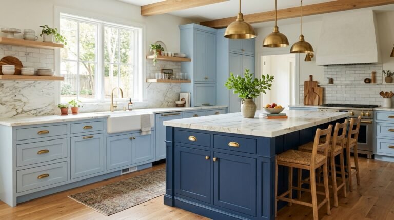
Imagine opening your kitchen door and smiling every single time. No clutter, no cramped corners, just a space that feels bright, calm, and beautifully organized. That is exactly what a thoughtful modular kitchen design can give you. Whether your home is tiny or spacious, the right cabinets, layout, and lighting can change how you cook, gather, and live. In this article, you will find 20 practical and visually stunning ideas, from handleless white cabinets and sage green shades to pull-out pantries, island seating, and smart corner storage. Each idea solves a real problem, like limited space, messy counters, or a dull look. I’ve noticed that small upgrades often make the biggest difference, and you do not always need a full renovation. Keep scrolling, save your favorites, and get ready to find the idea that fits your home perfectly.
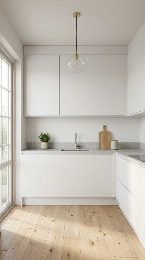
Handleless White Cabinets
- Smooth fronts make even a small kitchen feel wider and calmer.
- No handles means fewer spots to catch dust, grease, or sleeves.
- Pairs easily with wood, stone, or soft pastel accents.
- Push-to-open or channel grips keep the look clean without losing function.
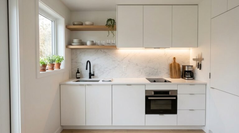
Ever walked into a kitchen and felt instantly calm? Handleless white cabinets often create that exact feeling. The flat, uninterrupted fronts reflect light and remove visual clutter, so the whole room looks larger and more organized. In a modular kitchen design, this simple choice acts like a clean canvas, letting countertops, lighting, and small decor pieces stand out. I’ve noticed that homeowners with compact apartments love this look because it never feels heavy. Add a slim channel grip or push-to-open hardware, and daily use stays easy. The result is a sleek, timeless space that still feels warm and welcoming.
Light, clean, and surprisingly practical, white fronts work in almost every home. The secret is texture. A matte finish hides fingerprints better than glossy surfaces, while a subtle wood grain or stone countertop adds depth. That’s why designers recommend it for rentals and family homes alike, especially when the lighting is soft and natural. Wiping down flat doors takes seconds, which busy households appreciate. Pair them with brass taps, woven baskets, or a leafy plant, and the room gains personality. You’ll notice the space feels brighter in the morning and cozier at night, which makes everyday cooking more enjoyable.
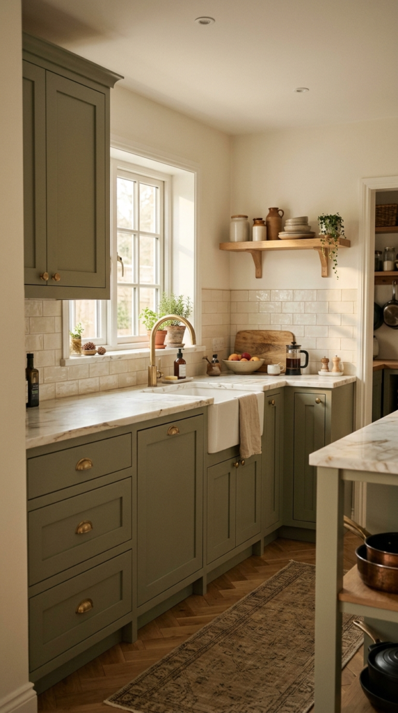
Sage Green Cabinets
- Adds color without overwhelming the room.
- Feels calming, like bringing a bit of garden indoors.
- Works beautifully with brass, white marble, and natural wood.
- Hides everyday smudges better than pure white.
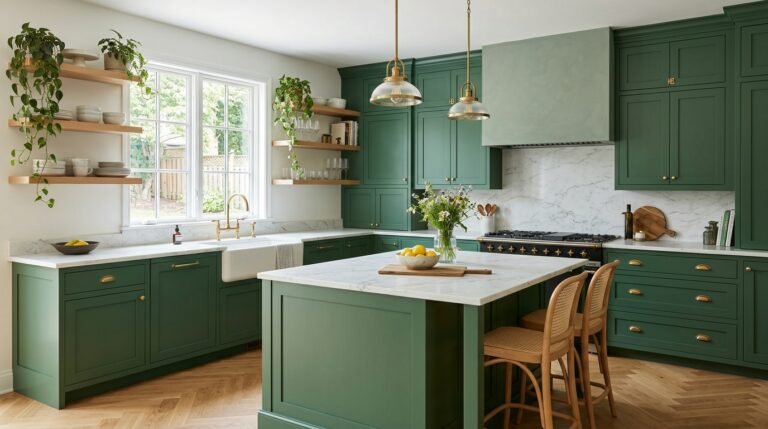
Want color that feels soothing instead of loud? Sage green is the answer many homeowners quietly fall in love with. This soft, earthy shade brings a fresh, garden-like energy into the kitchen without feeling bold or trendy. It sits comfortably between neutral and colorful, so it suits both small apartments and large family homes. In my experience, people expect it to feel dark, yet it actually brightens the room when paired with warm lighting. Add brass handles and a cream backsplash, and the whole space gains a calm, welcoming character that feels thoughtful, personal, and lasting.
Styling sage cabinets is easier than most people think. Start with a neutral base like white or warm beige walls, then layer in natural textures such as wood shelves, linen towels, and ceramic jars. The color changes gently with daylight, looking silvery in the morning and richer in the evening. That subtle shift keeps the kitchen interesting every day. Matte or satin finishes work best because they feel soft and forgiving. If you love a cozy farmhouse mood or a modern organic look, this shade adapts beautifully and photographs well, which is why it saves so often on Pinterest.
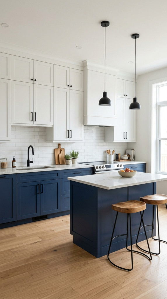
Two Tone Cabinetry
- Dark base grounds the room while light uppers keep it open.
- Lets you try bold color without committing the whole kitchen.
- Hides scuffs and splashes on lower doors.
- Adds depth that a single color often misses.
Can’t decide between bold and bright? Two-tone cabinetry lets you have both. A deeper shade below and a lighter one above creates a balanced look that feels designed, not accidental. The darker base anchors the space, while pale upper units keep the walls feeling open and airy. I’ve seen this work well in many homes, especially narrow kitchens that need depth without losing light. It also gives you a smart way to add color gently. If you love navy, forest green, or charcoal, using it only on the lower half feels confident and still very easy to live with.
Style matters just as much as color here. Keep the countertop light so the contrast stays crisp, and repeat the darker shade in one small detail, like stools, a pendant light, or a vase. That tiny echo ties everything together. Matte black or brushed brass handles add a polished finish that feels modern and warm. Practically speaking, darker lower doors hide scuffs, splashes, and daily wear better than pale ones, which is a bonus in busy family kitchens. The final look is layered, stylish, and full of character, while remaining easy to refresh later with new paint or hardware.
please also read:19 colored kitchen cabinets
Matte Black Cabinets
- Creates a bold, high-end look instantly.
- Makes light countertops and wood accents pop.
- Hides stains and splashes better than pale doors.
- Feels sleek and modern without extra decoration.
Think black cabinets will make your kitchen feel small? Think again. Matte black fronts add instant drama and a high-end feel, especially when balanced with light countertops and warm lighting. The deep color creates contrast that makes every detail stand out, from brass handles to wooden shelves. In a modular kitchen design, black units look sharp because clean lines and flat panels show off the finish beautifully. I’ve noticed that homeowners who try it rarely regret it, since the look feels confident, timeless, and surprisingly easy to style with simple decor choices and good lighting.
The trick is balance. Pair dark cabinets with a light backsplash, warm wood, or a pale floor so the room still feels open. Layered lighting under the wall units and a pendant above the counter keeps the space inviting at night. Choose a true matte or soft-touch finish, because it resists fingerprints and glare far better than glossy surfaces. That’s why many designers recommend it for modern apartments and busy family homes. A quick wipe with a soft cloth keeps it fresh, and the result is a kitchen that feels bold, cozy, and beautifully put together.

Terracotta Cabinets
- Brings warmth and personality without feeling loud.
- Pairs well with cream, wood, and brass.
- Gives a cozy, sun-baked Mediterranean feel.
- Hides everyday marks better than pure white.
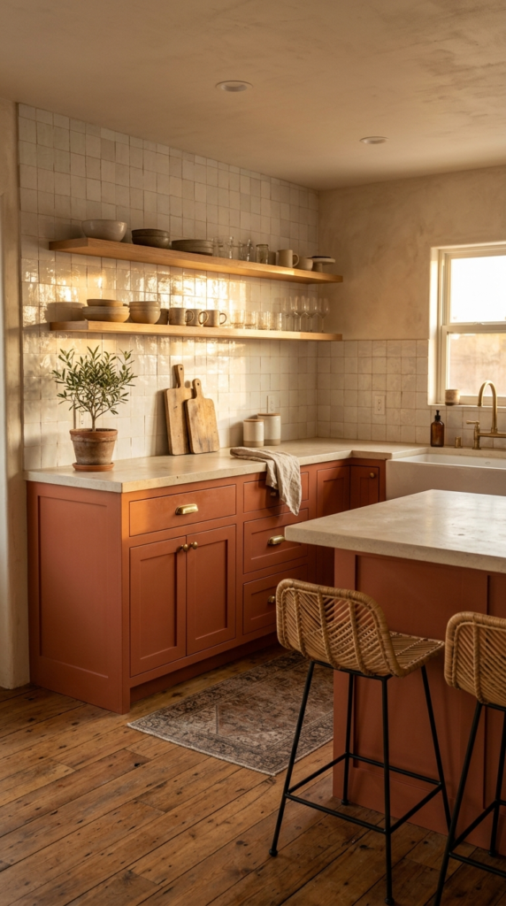
Craving a kitchen that feels like a warm hug? Terracotta cabinets bring sunny, earthy character that few other shades can match. This soft clay tone sits between orange and brown, so it feels grounded rather than flashy. It looks lovely in sunlit rooms, where the color glows gently through the day. I’ve seen this work well in many homes that felt flat or cold before. Add cream walls, a woven stool, and a small plant, and the space turns inviting, relaxed, and full of life without needing a complete renovation or expensive extras.
Terracotta shines when you keep everything else simple. Choose creamy whites, natural wood, and handmade-style tiles so the color remains the star. Brass or matte bronze handles add a soft glow that suits the warm palette perfectly. In my experience, a satin finish works best because it looks rich without reflecting too much light. The shade also changes with the day, appearing peachy in the morning and deeper at sunset. That gentle shift keeps the kitchen interesting, and it photographs beautifully, which explains why Mediterranean and boho kitchens are saved so often on Pinterest.
Fluted Wood Panels
- Adds texture and depth to plain flat doors.
- Gives a warm, boutique-hotel feel.
- Softens modern kitchens with natural wood tones.
- Looks stunning under soft accent lighting.
Want your kitchen to feel layered instead of flat? Fluted wood panels bring instant texture and warmth. The vertical grooves catch light in beautiful ways, creating soft shadows that change through the day. Even a simple modular kitchen design feels custom and luxurious with this detail. I’ve noticed that people often use it on an island or a tall unit first, then fall in love and add more. Paired with neutral countertops and gentle lighting, the wood tones feel rich, calm, and inviting, giving the whole space a polished, designer-style character.
Fluted textures work best when you let them shine. Keep surrounding surfaces simple with soft beige, white, or stone finishes, and add a warm LED strip to highlight the grooves at night. That’s why many designers recommend it as a feature panel rather than covering every surface. Walnut and oak both look lovely, depending on how warm you want the mood. Cleaning is easy with a soft brush or damp cloth, so dust never lingers. The result is a kitchen that feels tactile, elegant, and full of quiet personality that people want to save.

Open Wood Shelving
- Breaks up heavy rows of wall cabinets.
- Keeps everyday dishes within easy reach.
- Adds warmth with natural wood and small decor.
- Makes the kitchen feel lighter and more open.
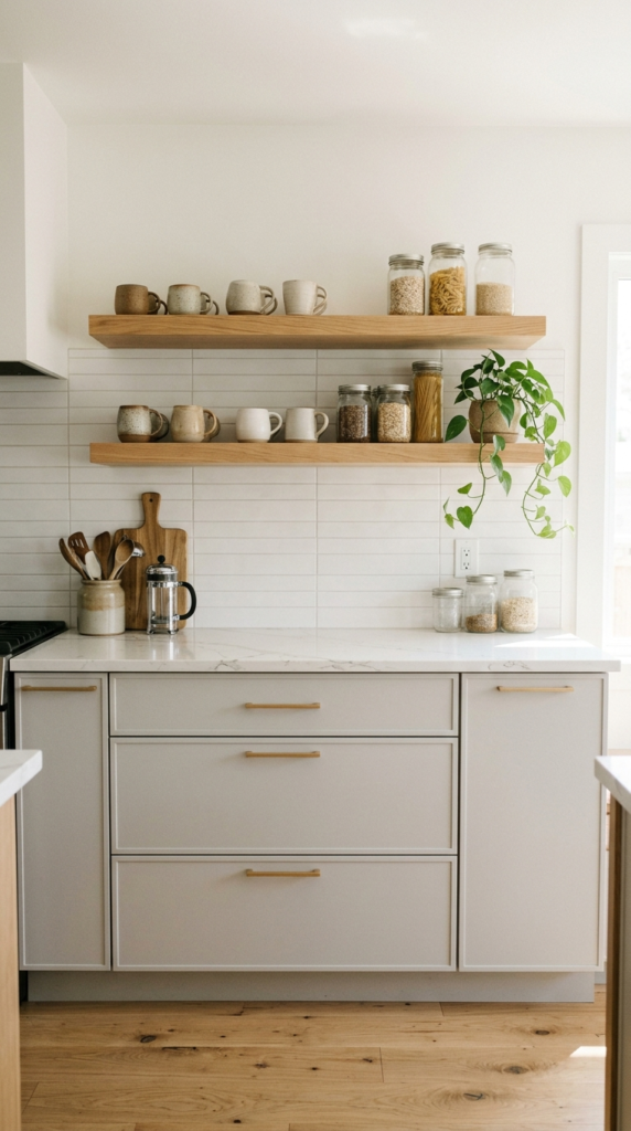
Tired of kitchens that feel boxed in? Open shelves can change that quickly. Replacing a few wall cabinets with floating wood planks lets light travel across the room, so walls feel taller and the space feels friendlier. In a modular kitchen design, mixing closed storage below with open shelves above creates a smart balance of function and charm. I’ve noticed that people love how easy it is to grab a mug or spice jar without opening a door. A few plants and neat ceramics finish the look beautifully, giving the room personality and instant style.
The key is keeping shelves edited. Stick to everyday items in matching tones, such as white plates, glass jars, and wooden boards, so the display looks calm instead of cluttered. In my experience, two or three shelves are plenty. Place the most-used items at hand height and lighter decor higher up. Dust can build up, so choose pieces you actually use often, which keeps cleaning simple. Warm oak or walnut shelves soften sleek cabinets and add natural texture. The result is a kitchen that feels lived in, welcoming, and effortlessly stylish.
Kitchen Island Seating
- Turns the kitchen into a social gathering spot.
- Adds extra prep space and casual dining.
- Defines the cooking zone in open layouts.
- Pendant lights add warmth and style overhead.
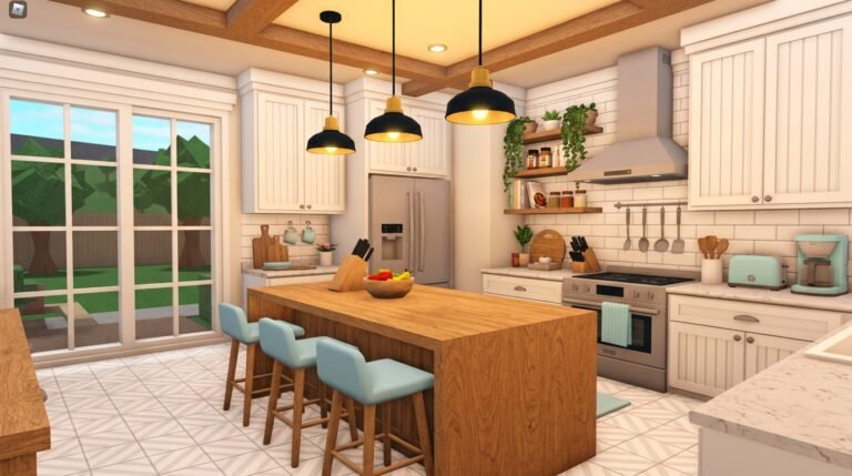
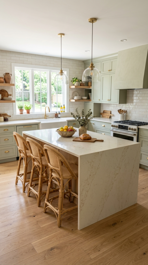
Picture morning coffee at a sunlit island while someone cooks beside you. That is the magic of island seating. It blends cooking, chatting, and snacking into one easy space, making the kitchen the heart of the home. Even a compact island with two stools adds useful counter room and a cozy spot for homework or quick meals. I’ve seen this work well in open-plan homes where the kitchen needs a gentle boundary. A waterfall edge or rounded corners make it feel polished, while soft lighting overhead turns the whole area into an inviting hangout.
Comfort decides whether an island gets used. Leave about 90 centimeters of walking space around it, and choose stools with back support if people will sit longer. That’s why many designers recommend measuring first and buying later. Hang pendant lights roughly 75 centimeters above the counter for even glow without blocking views. Durable quartz surfaces handle spills and hot pans with ease. Add a fruit bowl or a small vase, and the island becomes a styled focal point. The final look feels social, practical, and ready for everyday living and weekend gatherings.
Pull Out Pantry Units
- Shows everything at a glance, nothing gets lost.
- Uses narrow gaps that would otherwise be wasted.
- Keeps counters clear and clutter-free.
- Makes grocery unpacking faster and easier.
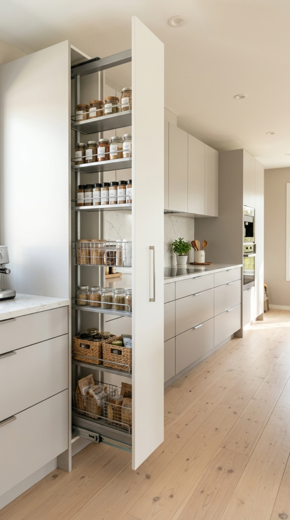
Ever lost a jar at the back of a deep cupboard? Pull-out pantry units solve that problem beautifully. Slim, tall drawers glide forward so every item is visible and reachable, even in a narrow gap beside the fridge. Smart storage like this is what makes a modular kitchen design feel truly organized. I’ve noticed that families save time daily because spices, oils, and snacks stay sorted. Inside, matching jars and labeled baskets create a neat, satisfying look. Even a small kitchen feels more spacious when storage works hard behind clean, simple doors without adding visual clutter.
Good planning makes these units shine. Choose soft-close runners and sturdy metal frames, because pantry loads get heavy quickly. In my experience, shelves with adjustable heights work best since bottles and boxes vary in size. Keep daily items at waist level and rarely used ones lower or higher. A pull-out only 15 centimeters wide can hold surprising amounts, which is perfect for compact homes. Wipe the shelves monthly to keep them fresh. The result is a calm, tidy kitchen where cooking feels smoother, shopping feels easier, and every inch quietly earns its place.
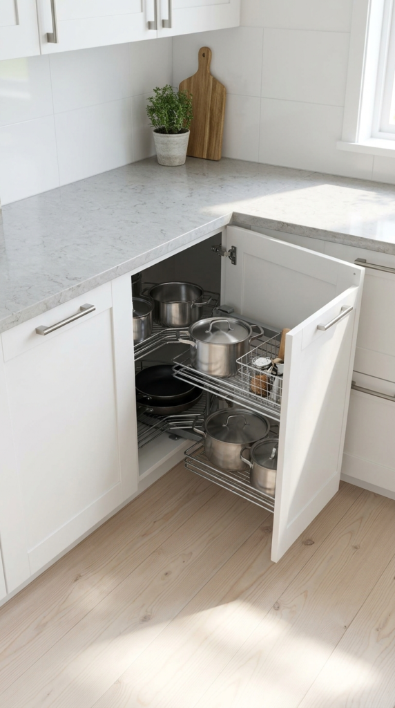
Corner Carousel Storage
- Turns a wasted corner into useful storage.
- Brings pots and pans to the front with one pull.
- Keeps counters clear and the room looking calm.
- Works in both small and large kitchens.
Ever stared into a dark corner cabinet and given up? Carousel storage fixes that problem for good. Rotating shelves or swing-out trays bring every pot, pan, and bowl right to the front, so nothing disappears into the shadows. Corners are usually the most wasted space in a kitchen, and this clever upgrade turns them into the most useful spot. I’ve noticed that people who add one rarely go back to plain shelves. Cooking feels faster, cupboards stay tidy, and the room looks calmer because fewer items end up scattered across the counters every day.
Choosing the right type matters. Kidney-shaped carousels suit L-shaped corners, while magic-corner pull-outs work better in narrow layouts. In my experience, sturdy metal frames and soft-close mechanisms are worth the extra cost, because pots are heavy and daily use adds up. Store frequently used cookware at the front and seasonal items on lower trays. Light-colored interiors help you spot things quickly, and a small LED strip inside makes evening cooking easier. Wipe the trays every few weeks to keep them fresh. The final result is a smart, hidden storage upgrade that makes the kitchen feel more organized and effortless.
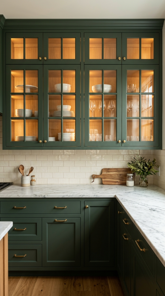
Glass Front Cabinets
- Adds a display feature without open-shelf dust.
- Breaks up heavy walls of solid doors.
- Lets you show off favorite dishes and glasses.
- Looks beautiful with soft interior lighting.
Want a kitchen that feels like a boutique showroom? Glass-front cabinets make it happen. They let you show off favorite plates and glasses while keeping dust away, which open shelves cannot do. The see-through doors break up solid walls of wood or paint, so the room feels lighter and more welcoming. I’ve seen this work well in kitchens that felt heavy or closed in. Add a soft light inside, and the display glows beautifully after dark. Even one or two glass doors can add charm, character, and a personal touch without a major renovation.
Styling is simple if you stay consistent. Choose plain white or neutral dishes, glassware, and a few wooden pieces so the display looks calm instead of busy. That’s why many designers recommend reeded or clear glass depending on how tidy you like to be, since textured glass softly hides clutter. Slim black or brass frames add a polished edge. Keep the heavier, everyday items in solid cabinets below. Wipe the glass with a microfiber cloth to avoid streaks. The result is an elegant, practical kitchen feature that feels timeless, welcoming, and very easy to maintain.
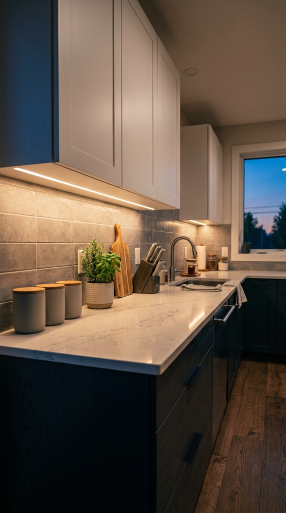
Under Cabinet Lighting
- Removes shadows from your work area.
- Adds a warm glow that makes the space feel finished.
- Highlights the backsplash like a feature wall.
- Easy upgrade, even for rentals.
Ever chopped vegetables in your own shadow? Under-cabinet lighting ends that frustration instantly. A slim LED strip tucked beneath the wall units washes the counter with even light, so cutting, measuring, and cleaning feel easier and safer. It also adds a warm glow that makes the kitchen look styled even when it is not. I’ve noticed that this small upgrade changes the mood more than people expect. Evening cooking feels cozy, late-night snacks feel calm, and the backsplash gets a beautiful highlight that turns simple tiles into a real feature of the room.
Details decide whether it looks professional. Choose warm white light around 3000K, because cooler tones feel harsh and clinical in a home. In my experience, dimmable strips are worth it, since you can go bright for cooking and soft for relaxing. Mount the strip near the front edge of the cabinet to avoid glare on glossy countertops. Plug-in and rechargeable options suit rentals, while hardwired lights suit full renovations. Hide the cables neatly behind a small lip. The final look is bright, functional, and welcoming, with a gentle glow that makes the whole kitchen feel finished.
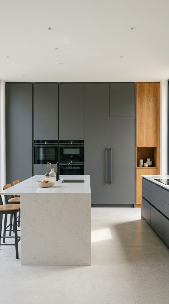
Built In Appliance Wall
- Hides bulky appliances behind clean, matching panels.
- Puts the oven at eye level for easier cooking.
- Keeps counters open for prep and styling.
- Gives even small kitchens a polished, custom look.
Want a kitchen that looks like one smooth, seamless piece? A built-in appliance wall does exactly that. The oven, microwave, and fridge sit flush inside tall cabinetry, so nothing sticks out or breaks the clean lines. Instead of a mix of metal boxes, you see calm, matching panels that feel intentional and designed. I’ve noticed that this layout also makes cooking easier, because the oven sits at eye level and there is no bending to check a tray. Even a small kitchen feels more polished when the appliances blend in, leaving the countertop open for prep and styling.
Planning is the secret here. Leave a small ventilation gap around the oven and fridge, because heat needs room to escape. In my experience, it helps to choose the appliance sizes first and let the cabinet maker build around them. Keep the microwave at chest height so hot dishes are easy to lift out. A wood accent column or a pale stone floor adds warmth against sleek gray doors. That’s why many designers recommend this setup for modern apartments and family homes alike. The result is a tidy, practical wall that looks expensive and works hard every single day.
Deep Drawer Organizers
- Shows every item at a glance from above.
- Replaces dark, deep cupboards with easy access.
- Dividers keep plates, bowls, and utensils in place.
- Makes cleanup and putting away much faster.
Ever bent down and dug through a cupboard just to find one bowl? Deep drawers make that struggle disappear. Instead of reaching into dark corners, you pull the whole drawer out and see everything from above. Plates, pots, and bowls sit neatly in rows, each with its own spot. I’ve noticed that people who switch from doors to drawers in the lower kitchen units rarely want to go back. Cooking feels smoother, cleanup is faster, and the kitchen stays calmer because every item has a clear home that is easy to reach and put away.
Details make drawers work even better. Add wooden dividers for cutlery, peg boards for plates, and slim trays for knives so nothing slides around. In my experience, full-extension soft-close runners are worth paying for, since heavy dishes can strain cheap hardware. Measure your most-used items before ordering, so every compartment fits perfectly. Keep everyday plates in the top drawer and bulky pots below. Wiping the dividers every few weeks keeps them fresh and tidy. The final look is clean and quiet, with handleless fronts hiding a smart, perfectly organized interior that makes daily cooking feel easier.

Stone Slab Backsplash
- Fewer grout lines mean a smoother, calmer wall.
- Natural veining works like built-in artwork.
- Turns a plain wall into a real focal point.
- Pairs beautifully with navy, green, or warm wood.
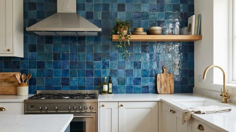
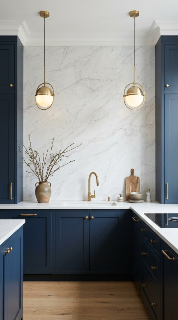
Imagine one unbroken sheet of stone running from the counter to the ceiling. That is the power of a slab backsplash. With fewer grout lines, the wall looks smooth, expensive, and wonderfully calm. The natural veining acts like built-in artwork, so you barely need extra decor. I’ve seen this work well in kitchens that felt plain or dated, since one bold surface can lift everything around it. Pair it with navy, green, or warm wood cabinets, and the contrast feels rich and intentional. Even a small wall becomes a stunning focal point that guests notice right away.
Budget worries are common, and there are smart ways around them. Porcelain slabs and quartz look remarkably like marble but resist stains and heat far better. In my experience, they suit busy kitchens where oil and sauce splashes happen daily. Ask for a single slab behind the hob, rather than the whole wall, to save money while keeping the dramatic effect. Wipe it with a soft damp cloth, and avoid harsh acids on natural stone. That’s why many designers recommend sealing marble once a year. The result is a refined, long-lasting wall that feels luxurious without constant worry.
L Shaped Layout
- Creates a natural cooking triangle for faster movement.
- Leaves one side open for dining or seating.
- Gives continuous counter space around the corner.
- Works in both small and large homes.
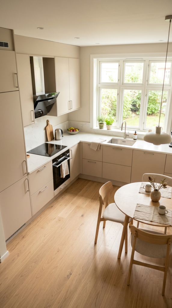
Ever wished your kitchen felt easier to move around in? An L-shaped layout is one of the friendliest answers. Two connected walls form a natural cooking triangle between the sink, hob, and fridge, so every step feels short and logical. The open side stays free for a small dining table or a casual seating spot. I’ve noticed that this shape suits both tiny apartments and larger family homes, because it adapts so well. Counters flow around the corner without interruption, which gives you generous prep space and a clean, balanced look that feels organized instantly.
Placement decides how well this layout works. Keep the fridge at the end of one arm so it never blocks the cooking zone, and place the sink near the window for daylight while washing up. In my experience, the corner is the hardest spot, so a pull-out or carousel unit there is worth every penny. Leave about 100 centimeters between the arms. Soft beige or warm gray cabinets keep the room bright, while brushed steel handles add a tidy finish. The result is a practical, welcoming kitchen that feels spacious without needing extra square footage.
Appliance Garage Corner
- Hides small appliances behind a neat roll-up door.
- Keeps the countertop clear and easy to wipe.
- Makes the morning routine quick and organized.
- Adds a custom, finished look to the kitchen.
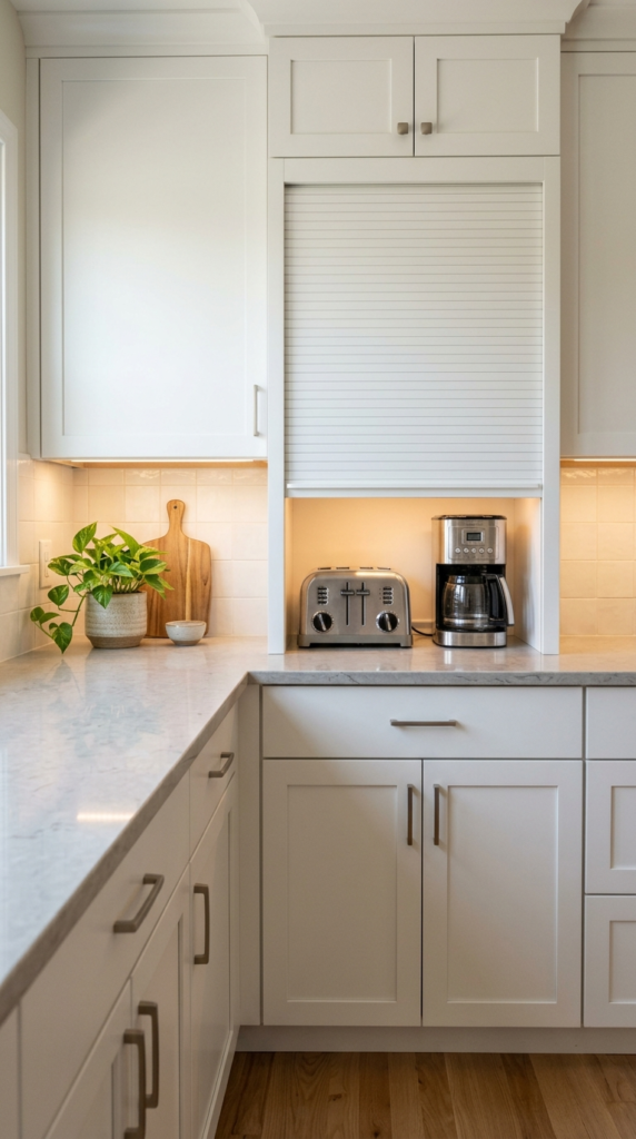
Messy counters can ruin even a beautiful kitchen. An appliance garage fixes that quietly. It is a small cabinet section with a roll-up or flip-up door that hides the toaster, kettle, and coffee maker when they are not in use. Open it in the morning, and everything is ready; close it, and the counter looks clean again. I’ve seen this work well in compact kitchens where every inch of worktop matters. Placed in a corner or beside the hob, it keeps daily gadgets close without turning them into visual clutter that makes the whole room feel crowded.
Practical details make this feature shine. Install a power socket inside the garage, so appliances can stay plugged in and ready to use. That’s why many designers recommend a sliding tambour door, since it tucks away without needing extra swing space. Choose a depth of about 40 centimeters, and add a ventilated back panel so heat from the kettle or toaster can escape safely. Matching the door to your cabinet color keeps the look seamless, while a wooden interior adds warmth. Wipe the track occasionally to keep it gliding smoothly. The result is a calm, tidy countertop.
Floating Cabinet Design
- Visible floor makes the room feel bigger and lighter.
- Makes sweeping and mopping much easier.
- Soft glow underneath adds a floating, designer effect.
- Great for small kitchens that feel heavy or crowded.
Want your kitchen to feel lighter without changing its size? Floating cabinets do that beautifully. When base units hang off the wall, the floor stays visible beneath them, and the eye reads more open space. The room instantly feels airier and more modern. I’ve noticed that compact apartments benefit the most, since heavy blocks of cabinetry often make small kitchens feel closed in. Add a slim LED strip underneath, and the cabinets seem to hover softly above the ground. The result is a clean, stylish look that feels calm, spacious, and surprisingly simple to live with every day.
Strong installation is the secret to making this idea work. Wall-mounted base units must be fixed into solid brick or reinforced walls, so always ask your fitter to check the structure first. In my experience, lighter cabinet colors suit this style best because they add to the floating effect. Keep the space underneath clear for easy cleaning with a mop or robot vacuum. That’s why many designers recommend it for modern city homes. Pair it with a quartz countertop and soft lighting, and the kitchen feels elegant, practical, and effortlessly tidy for years.

Tall Unit Storage
- Uses full wall height for extra storage.
- Keeps rarely used items neatly out of sight.
- Creates a clean, seamless wall of cabinetry.
- Frees up counters and lower cupboards for daily items.
Running out of storage space? Look up. Tall units stretch from floor to ceiling and quietly double your storage without taking extra floor space. Pots, trays, bulk groceries, and seasonal items all disappear behind clean, matching doors. I’ve seen this work well in small homes where every inch counts. The kitchen looks calmer because fewer things sit out on the counters. Even a simple row of tall cabinets feels like a custom feature wall, giving the room a polished, organized character that is both practical and visually satisfying from the moment you walk in.
Smart planning makes tall units even better. Keep everyday items between shoulder and knee height, and store rarely used pieces on the highest shelves with a small step stool nearby. In my experience, pull-out trays inside tall cabinets work better than fixed shelves, because you can see everything at once. Choose soft-close hinges and sturdy runners, since heavy loads are common. Matching the doors to the wall color makes the room feel taller and cleaner. The result is a spacious, tidy kitchen where every item has a place, and the whole space feels organized and effortless.

Parallel Kitchen Layout
- Keeps everything within a few steps while cooking.
- Gives plenty of counter and storage on both sides.
- Works well in long, narrow rooms.
- Offers a clear, simple walkway for easy movement.
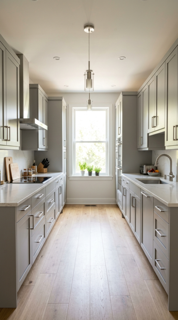
Ever noticed how professional kitchens run in straight lines? There is a reason for that. A parallel layout places two rows of cabinets facing each other, so the sink, hob, and fridge are always just a turn away. Cooking feels fast and smooth because nothing is far from reach. I’ve noticed that long, narrow rooms suit this design perfectly. You get generous counter space and loads of storage on both sides, while the center stays open for easy movement. The whole kitchen feels efficient, organized, and surprisingly spacious, even when the room itself is not very wide.
Spacing is the key detail. Keep about 110 to 120 centimeters between the two rows, so two people can move comfortably without bumping into each other. In my experience, placing a window or glass door at the far end makes the room feel brighter and longer. Use light cabinet colors and good ceiling lighting to avoid a tunnel effect. That’s why many designers recommend this layout for apartments and small family homes. Keep the sink and hob on opposite sides, with the fridge near the entrance. The result is a smart, balanced kitchen that is easy to use.
Conclusion
A beautiful kitchen does not have to be big or expensive. It just needs smart choices that match the way you live. From calming colors to clever storage and clean layouts, these ideas show how a modular kitchen design can make everyday cooking easier and far more enjoyable. I’ve seen how small changes like these can completely transform a space. Pick one or two ideas that speak to you and try them in your own home. Save this post on Pinterest so you can come back to it anytime, and share it with a friend who is planning a kitchen makeover. Your dream kitchen is closer than you think!