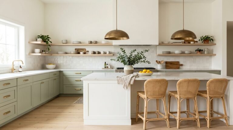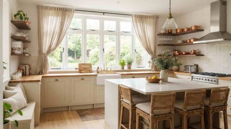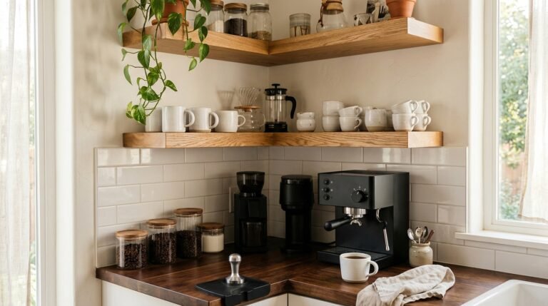
Your kitchen should feel like the heart of your home, not a room you rush through. If you are collecting kitchen remodel ideas and feeling overwhelmed by endless choices, this guide will make the whole process feel simple, exciting, and doable.
Inside, you will find fresh looks that range from bold emerald cabinets and glowing pendant lights to clever storage and cozy wood details. Each idea solves a real problem, whether that means clearing cluttered counters, brightening a dim corner, or adding warmth to a plain space. In my experience, the biggest transformations often come from a few smart choices rather than a full teardown, and I’ve noticed how quickly a kitchen feels new when lighting, color, and storage work together. Grab your favorite drink, save the ideas that make you smile, and get ready to picture the kitchen you have always wanted.
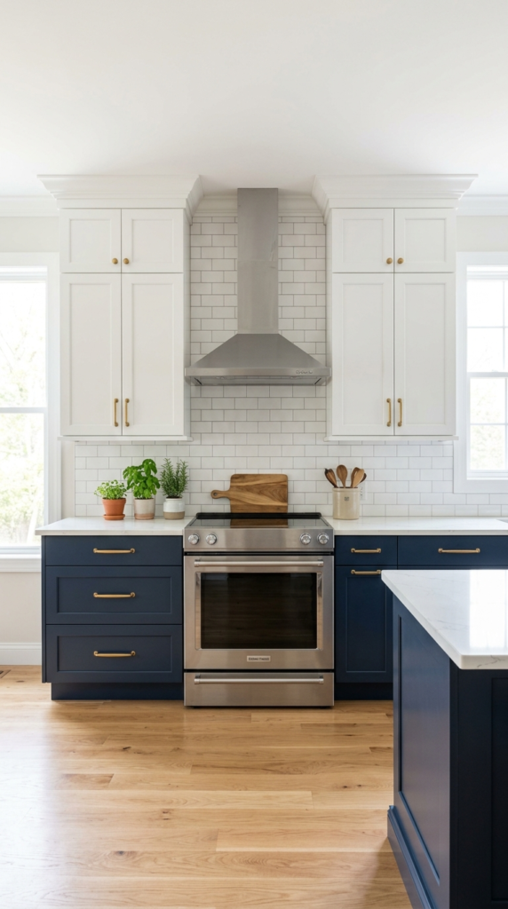
Two Tone Cabinets
- Adds depth and contrast without painting the whole room a bold color.
- Dark lowers hide scuffs and daily wear near the floor.
- Light uppers keep the space bright and open.
- Brass or black hardware ties both colors together.
Why choose one cabinet color when two can double the impact? Pairing a deep lower tone with light uppers gives the room instant depth while keeping walls bright and airy. Darker bases hide scuffs, toe-kick marks, and splashes, which is a real bonus in busy households. If you are gathering kitchen remodel ideas that feel custom without a custom price, this one delivers. Navy, forest green, and charcoal all pair beautifully with white or cream uppers. Add warm brass pulls, and the contrast looks intentional, balanced, and quietly luxurious from the moment you walk through the doorway.
Balance is the secret to getting this look right. In my experience, keeping the darker shade on the bottom grounds the room, while flipping it can make ceilings feel lower. Choose a matte or satin finish for a soft, modern feel, and repeat one of the cabinet colors somewhere else, such as a stool, a rug, or a vase. Test paint samples next to your countertop before committing, since undertones shift in daylight. You will notice the room gains depth and personality, and the cabinets finally feel like a design feature instead of simple storage.
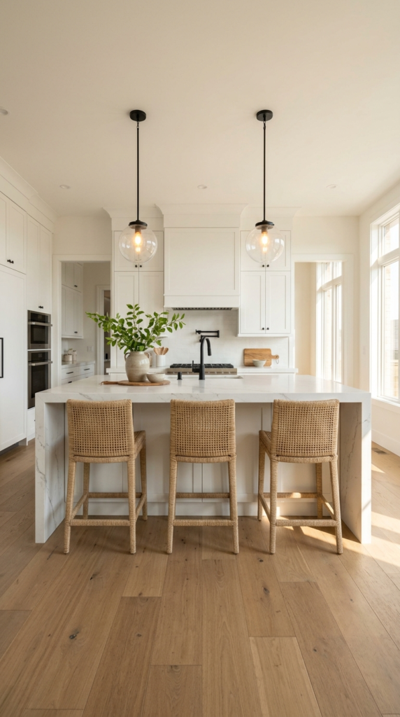
Waterfall Edge Island
- Turns the island into a sculptural focal point.
- Protects cabinet sides from kicks, scuffs, and bumps.
- Creates a clean, seamless look with no visible end panel.
- Offers generous prep space and casual seating in one piece.
An island can be the star of the room, and a waterfall edge makes it unforgettable. The countertop material continues down the sides to the floor, creating a bold, seamless block that looks like a piece of furniture. It also protects the cabinet ends from kicks and scratches, which keeps the finish fresh for years. Choose quartz or porcelain with soft veining for a calm, elegant effect. Add two pendants overhead and a few woven stools, and the whole space feels like a showroom while remaining easy to live in every day.
Planning matters because this feature needs precise cutting. I’ve noticed that matching the vein direction on the top and sides makes the stone look carved from a single slab, so ask your fabricator to lay it out first. Leave at least forty-two inches of walkway around the island so people can pass comfortably. Add outlets on the end panel for charging and small appliances. Wipe spills quickly on lighter stone to avoid stains. You will notice the room feels more polished, gatherings naturally center around the island, and daily cooking becomes easier with generous space to spread out.
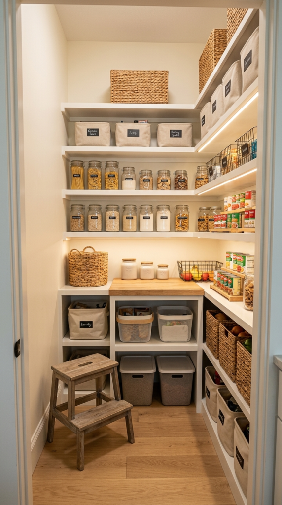
Walk In Pantry Nook
- Gives bulk groceries and small appliances a dedicated home.
- Keeps counters clear so the main room feels calmer.
- Clear jars and labels make meal planning faster.
- Works even in a small closet or unused corner.
A hidden pantry can change how the whole house runs. Instead of crowding cabinets and counters, a small walk-in space holds groceries, appliances, and bulk items in one organized spot. Even a shallow closet or unused corner can work with adjustable shelves and good lighting. Matching jars, baskets, and labels make everything easy to find at a glance. That’s why many designers recommend a dedicated pantry in any major update. Add a small counter for the toaster and air fryer, and the main room stays clean, quiet, and ready for guests whenever they stop by.
Organization is what makes this idea shine. In my experience, shelves about twelve inches deep work best, because anything deeper turns into a black hole where food expires unseen. Store heavy items at waist height, daily snacks at eye level, and rarely used platters up high. Install motion-activated LED strips so you never fumble in the dark. Group similar items in bins labeled by category, such as baking, breakfast, and snacks. You will notice shopping gets easier, food waste drops, and your countertops finally stay clear, which makes the entire kitchen look larger and more inviting
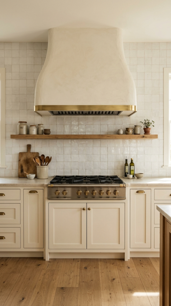
Statement Range Hood
- Turns a necessary appliance into the focal point of the wall.
- Plaster, wood, or painted finishes make it feel custom.
- Draws the eye upward and adds height to the room.
- A strong vented fan keeps steam and grease under control.
A range hood doesn’t have to be a boring metal box. Wrapping it in plaster, wood, or painted cabinetry turns a needed appliance into the focal point above your cooktop. Curved shapes feel soft and European, while sleek boxes look crisp and modern. Because the hood sits at eye level, it shapes how the whole wall feels. If you are collecting kitchen remodel ideas that make a dramatic difference, this one is hard to beat. Pair a cream plaster finish with warm brass trim and a simple tile backdrop, and the cooking wall instantly looks custom, calm, and polished.
Function matters just as much as looks here. I’ve noticed that a hood should be at least as wide as the cooktop, and ideally a few inches wider, so it captures steam and grease properly. Mount the bottom edge about thirty inches above gas burners or slightly less above electric ones, following the manufacturer’s guide. Choose a strong, quiet fan with a vented exterior duct, since recirculating models clean the air less effectively. You will notice cooking smells fade faster, the wall stays cleaner, and the whole space feels more intentional, practical, and designer-approved.
please also read: 21 what size kitchen trash can
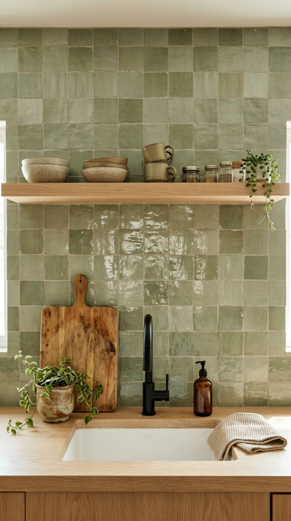
Zellige Tile Wall
- Uneven handmade glaze catches light and adds shimmer.
- Soft earthy colors feel relaxed rather than formal.
- Every tile is slightly different, so the wall looks one of a kind.
- Adds texture to a clean, simple layout.
Handmade tile has a glow that flat, factory finishes can’t copy. Zellige tiles have slightly uneven edges and glossy glazes, so light bounces across the wall in soft, shimmering waves. Soft white, sage, and clay tones look especially lovely and feel relaxed rather than formal. Use them as a full wall behind the sink or simply behind the stove, and the room gains instant depth and character. Because every tile is a little different, the finished surface feels organic and collected over time. It is an easy way to add warmth and texture to a clean, simple layout.
Installation takes a little patience, but the payoff is worth it. I’ve seen this work well in many homes when the installer mixes tiles from several boxes before setting them, which keeps color variation looking natural instead of patchy. Use a slightly wider grout line, and choose a tone close to the tile so the surface reads as one soft texture. Seal the grout after curing to protect it from cooking splatters. Expect the glaze to show crackles and chips, which are part of the charm. You will notice the wall becomes the warm, glowing heart of the kitchen.
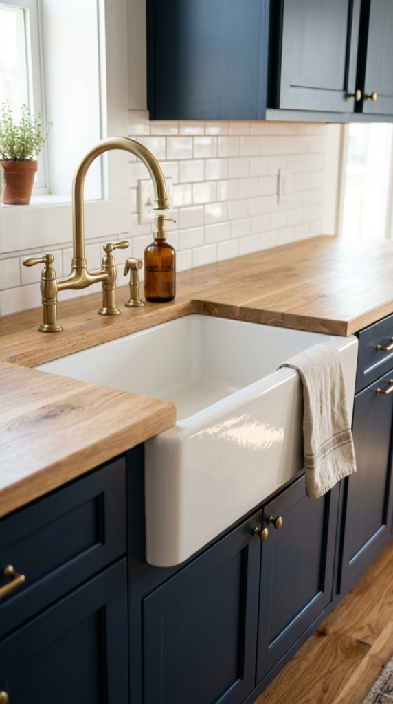
Farmhouse Apron Sink
- The exposed front gives the sink a bold, sculptural look.
- A deep bowl fits large pots and baking sheets easily.
- Sits close to the edge, so cleanup feels more comfortable.
- A bridge faucet adds vintage charm.
A deep apron sink brings instant charm to any cooking space. The exposed front panel sits flush with the cabinet edge, creating a bold, sculptural detail that draws the eye. It also lets you lean closer to the basin, which feels more comfortable during long cleanups. White fireclay is the classic choice, while stainless steel suits modern rooms. The roomy bowl swallows baking sheets, stockpots, and oversized pans without any awkward angling. Pair it with a bridge faucet in brushed brass or matte black, and the sink area turns into a warm, welcoming centerpiece.
Cabinet fit is the detail people forget. In my experience, apron sinks need a base cabinet cut to match the exact model, so buy the sink first and give the specs to your installer. Reinforce the cabinet, because a full fireclay basin can weigh over a hundred pounds before it is filled with water. Choose a sink with a clean, protected glaze, and use a bottom grid to prevent scratches. Wipe the front panel with mild soap, not harsh scrubbers. You will notice the sink feels roomier, cleanup gets easier, and the whole wall gains timeless character.
Built In Breakfast Banquette
- Turns an unused corner into a cozy eating spot.
- Hidden drawers under the seat add extra storage.
- A round table keeps walkways open in tight rooms.
- Pillows and a pendant light add warmth with little effort.
Why squeeze around a bulky table when a bench can hug the wall? A built-in banquette tucks seating into a corner, freeing floor space and creating the coziest breakfast spot in the house. Drawers under the seat hold placemats, seasonal platters, and rarely used gadgets. A round pedestal table keeps legs out of the way, so sliding in feels easy. Choose a wipe-clean performance fabric or faux leather, since crumbs and spills are guaranteed. Add a few pillows and a woven pendant overhead, and the corner turns into a warm gathering place everyone fights over.
Comfort and sizing decide whether this idea works. In my experience, a seat height of about eighteen inches with a slightly angled back feels best for long meals. Allow roughly twenty-four inches of table width per person, and leave about twelve inches between the bench edge and the table for easy movement. Add a thin cushion, not a thick one, so the drawers still open fully. Hang the pendant about thirty inches above the tabletop for a soft glow. You will notice the family lingers longer, homework and coffee share the same table, and the room feels more social.

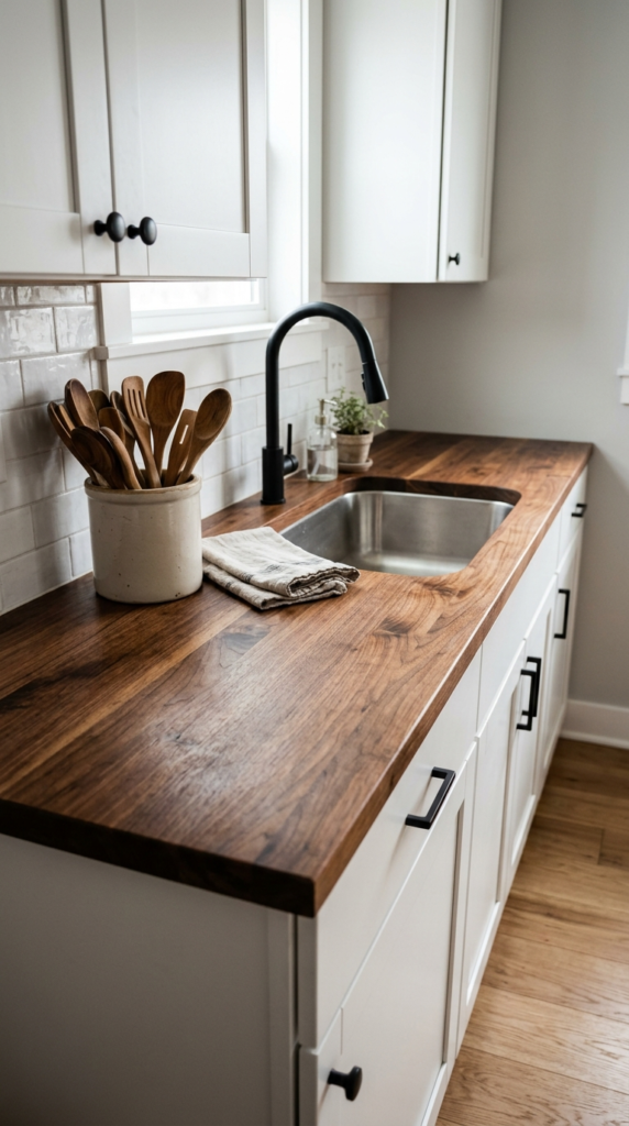
Butcher Block Counters
- Adds natural warmth next to white or navy cabinets.
- Costs less than most stone countertops.
- Light scratches can be sanded out and refinished.
- Feels softer on dropped plates and glasses.
Nothing warms a white kitchen faster than real wood. Butcher block counters bring visible grain, soft color, and a lived-in feel that cold stone often lacks. They cost less than most quartz or granite, and they are gentle on dropped glasses and plates. Walnut looks rich and dramatic, maple stays light and airy, and oak sits happily in between. Pair the wood with white or navy cabinets and matte black hardware for striking contrast. Even one section, such as an island top or a coffee corner, adds welcome texture and makes the whole room feel relaxed and inviting.
Sealing is the step that keeps wood looking beautiful. I’ve noticed that food-safe mineral oil applied monthly for the first few months builds a protective layer, then every few months afterward is enough. Around the sink, a waterproof finish such as hardwax oil prevents dark water stains. Wipe spills quickly and use trivets for hot pans. Light scratches and knife marks can be sanded out and re-oiled, which stone cannot offer. You will notice the surface develops a soft patina over time, and the kitchen gains character that improves with every year of cooking.
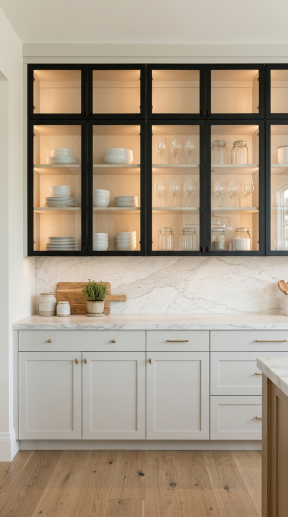
Glass Front Cabinets
- Breaks up a heavy wall of solid doors.
- Lets you show favorite dishes while keeping dust out.
- Interior lights create a soft evening glow.
- Even two or three glass doors make a big difference.
A wall of solid doors can feel heavy, and glass fronts lighten it instantly. Replacing just two or three upper doors lets light travel through the cabinets and gives the wall depth. Unlike open shelves, the glass keeps dust and grease off your dishes, which is a real relief near the cooktop. Display white plates, stemware, or colorful pottery you love. Thin black or brass frames look crisp and modern, while wood mullions feel classic. The result is a display that feels curated, elegant, and personal, without the constant cleaning that open shelving demands.
Styling inside glass doors takes restraint. That’s why many designers recommend sticking to one or two colors and grouping items by height, with taller pieces at the back. Hide the cluttered everyday mugs in lower cabinets and keep only your prettiest pieces on show. Add a battery-powered or hardwired LED strip inside each cabinet, and the contents glow beautifully after dark. Consider reeded or seeded glass if you prefer a softer look that blurs small imperfections. You will notice the wall feels lighter, evening ambiance improves, and the kitchen looks thoughtfully designed rather than simply stocked with storage.
Matte Black Hardware
- A quick weekend upgrade with a big visual payoff.
- Dark metal outlines each door for crisp definition.
- Repeating the finish ties the whole room together.
- Easy to swap later if your style changes.
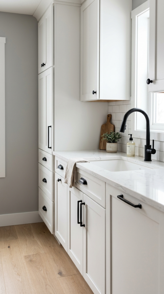
Hardware is the jewelry of the kitchen, and matte black makes a bold statement. Swapping dated pulls takes a screwdriver and an afternoon, yet the change looks dramatic. Dark metal outlines each door like a sketch, giving white and pastel cabinets crisp definition. Repeat the finish on the faucet, light fixtures, and stool legs so the room feels connected. Bar pulls suit modern doors, while cup handles feel classic on shaker styles. Choose a quality powder-coated finish, and the color will stay rich through years of daily use without chipping or fading.
Size and placement make hardware feel professional. I’ve noticed that pulls look best when their length is about one-third the width of the door or drawer. Place knobs on upper cabinet corners nearest the counter, and center long pulls on drawers. Use a drilling template to keep every hole identical, which prevents crooked rows. Bring one old pull to the store to match hole spacing, so you avoid drilling new holes. Mixing black with a warm wood accent softens the contrast. You will notice the cabinets look newer, the room feels pulled together, and the whole upgrade costs little.
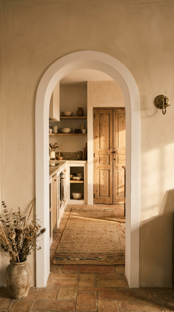
Arched Doorway Entry
- Softens the hard lines of a standard square opening.
- Frames the view into the kitchen like a picture.
- Separates open-plan spaces without closing them off.
- Adds architectural charm that paint alone can’t create.
Straight lines everywhere can make a room feel stiff, and an arch softens everything. Replacing a square opening with a gentle curve adds architectural charm that no paint color can match. It frames the view into the kitchen like a picture, and it separates spaces without closing them off. In open-plan homes, an arch gently marks where cooking begins. Smooth plaster edges, warm beige walls, and a woven runner underneath complete the soft, organic mood. Even a shallow arch applied over an existing doorway changes the personality of the room, making it feel warmer, calmer, and more thoughtfully designed.
Construction is simpler than it sounds. I’ve seen this work well in many homes where a contractor adds a curved drywall header or a pre-formed arch kit over the existing frame. Always confirm the wall is not load-bearing before cutting. Choose a radius that suits the opening width, since a half-circle works best for narrow doors and a flatter curve for wide ones. Finish with a smooth coat of paint in a color matching the walls. You will notice the entry feels softer, light flows more gracefully, and the whole space gains a custom, timeless character.
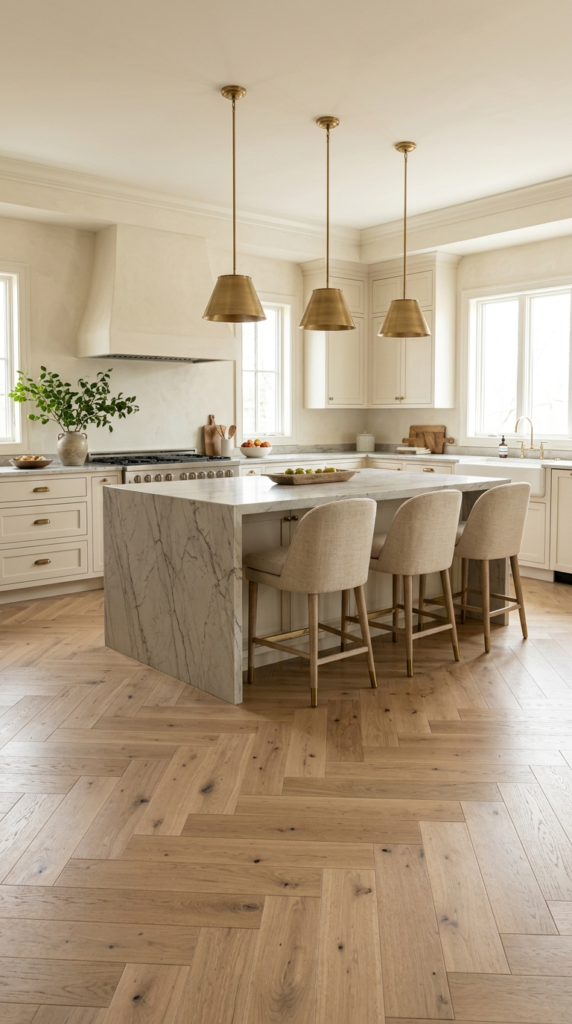
Herringbone Wood Floor
- The zigzag pattern adds movement across a large surface.
- Wood tones bring warmth to white and neutral rooms.
- Engineered or vinyl versions keep the cost realistic.
- Ties cabinets, island, and walls into one calm palette.
The floor is the largest surface in the room, so make it beautiful. A herringbone layout turns plain planks into a pattern that feels classic, tailored, and quietly luxurious. The zigzag draws the eye across the room and makes even a simple white kitchen look rich. Light oak keeps things airy, while walnut feels dramatic. Because the pattern hides small crumbs, scuffs, and wear better than straight planks, it suits busy homes surprisingly well. Pair it with white cabinets and brass lighting, and the room looks like a magazine spread that is still practical enough for everyday family life.
Material choice keeps this idea realistic for budgets. Engineered wood in a herringbone pattern costs less than solid planks and handles kitchen humidity better, while luxury vinyl offers a waterproof alternative with a similar look. In my experience, installers need extra material, usually fifteen percent, because angled cuts create more waste. Start the pattern from the center of the room so it stays balanced from every doorway. Wipe spills quickly and use felt pads under stools. You will notice the room feels warmer and more expensive, and the floor ties cabinets, counters, and walls together into one inviting space.
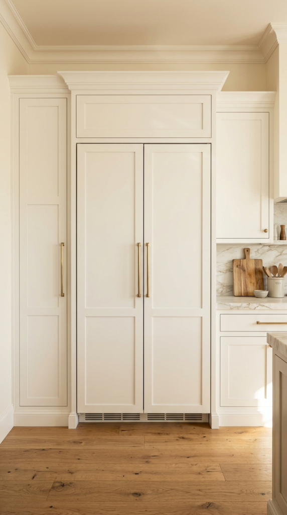
Paneled Refrigerator
- Hides a bulky appliance so the cabinet run looks seamless.
- Tall pantry units on each side create a custom built-in look.
- Matching handles and finishes make the wall feel calm and planned.
- Works especially well in open-plan rooms where the refrigerator is always visible.
Big appliances can break up a beautiful cabinet run, and panels make them disappear. A paneled refrigerator wears the same door fronts as the cabinets around it, so the wall reads as one calm, continuous surface. Tall pantry units on either side create a built-in look that feels custom and expensive. Choose a panel-ready model, and your cabinet maker will match the finish exactly. Add a slim brass handle, and the whole wall looks tailored. It is a smart move for open-plan rooms, where the refrigerator is always visible from the sofa.
Planning ahead prevents the most common headaches. In my experience, the biggest mistake is forgetting ventilation, since refrigerators need airflow around the sides and top to run efficiently. Ask your installer for the manufacturer’s clearance sheet before ordering cabinets. Leave a small gap so the door swings fully open without hitting nearby handles. Panel-ready models cost more than standard stainless, so compare prices against the savings of a simpler finish elsewhere. You will notice the room feels quieter and more streamlined, the eye travels smoothly along the cabinets, and the kitchen looks custom built.
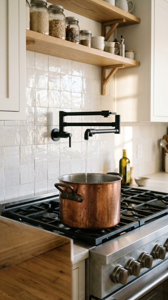
Pot Filler Faucet
- Fills heavy pots right on the stove, so you skip the carry.
- The folding arm tucks flat against the wall when not in use.
- Adds a chef-style detail to the cooking wall.
- A matching finish ties in your sink faucet and hardware.
Carrying a full pot of water across the room is nobody’s favorite chore. A pot filler solves it with a slim folding arm mounted right above the range. Swing it out, fill the pasta pot where it will boil, and fold it away again. It saves your wrists, prevents drips on the floor, and gives the cooking wall a polished, professional look. Choose a finish that matches your sink faucet, such as matte black or brushed brass. This small fixture feels like a luxury, yet it earns its place with daily use during busy dinners.
Installation needs a little planning, so decide early. I’ve noticed that the water line must run inside the wall before tile goes up, which is much cheaper than opening finished walls later. Ask a licensed plumber to add a shutoff valve so you can service the fixture easily. Mount the spout so it reaches the center of your largest burner, and keep it clear of the hood. Wipe the joints occasionally to prevent mineral buildup. You will notice dinner prep moves faster, floors stay drier, and the cooking zone feels organized and designed for people who love to cook.
Statement Pendant Lights
- Adds a glowing focal point above the island.
- Draws the eye upward and makes the ceiling more interesting.
- Gives focused task light right where you chop and eat.
- A dimmer switch shifts the mood from prep to dinner.
Lighting is jewelry for the ceiling, and pendants are the showpiece. A row of three globes above an island creates rhythm, glow, and a clear focal point. Opal glass spreads soft, flattering light, while woven or metal shades add texture. The fixtures also define the island as its own zone, which helps open-plan rooms feel organized. Choose warm bulbs around 2700 Kelvin so skin tones and food look appealing. Brass or black fittings can echo your hardware for a coordinated finish. The effect is welcoming, elegant, and stylish enough to be the first thing guests mention.
Size and spacing decide whether pendants look polished or awkward. That’s why many designers recommend hanging the bottom of each shade about thirty to thirty-six inches above the island surface. Space fixtures roughly twenty-four to thirty inches apart, and keep the outer ones inside the island’s edges. Avoid blocking sightlines to the living area by choosing glass or open designs. Put the lights on a dimmer, because bright prep light and soft dinner light are two different moods. You will notice the island feels more inviting, evenings feel calmer, and the whole room gains a layered glow.

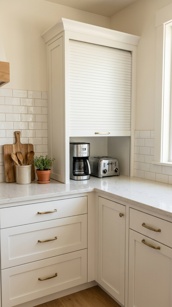
Appliance Garage Cabinet
- Hides small appliances behind a door, so the counter looks clean.
- Keeps cords tidy and dust away from daily machines.
- Painted to match the cabinets, it blends in as a built-in feature.
- Leaving appliances plugged in makes mornings faster.
Small appliances are useful, but they rarely look pretty on display. An appliance garage solves that with a cabinet section that has a roll-up or lift-up door, hiding the toaster, blender, and coffee maker. Pull the door up and everything is ready to use; close it and the counter looks spotless in seconds. It also keeps cords tidy and dust away from machines you use daily. Paint the front to match your cabinets, and the unit blends right in. If you are gathering kitchen remodel ideas for clutter control, this one is practical and surprisingly affordable.
Placement and power decide how well this idea works. In my experience, the best spot is a corner or the stretch of counter nearest the main outlet, so you never stretch cords across the work area. Ask an electrician to add outlets inside the cabinet, which lets you leave appliances plugged in and ready. Leave about eighteen inches of height for a tall coffee machine, and add ventilation holes so heat from toasters can escape. You will notice the counters stay clear, mornings feel faster, and the whole room looks calmer, cleaner, and far more organized than before.
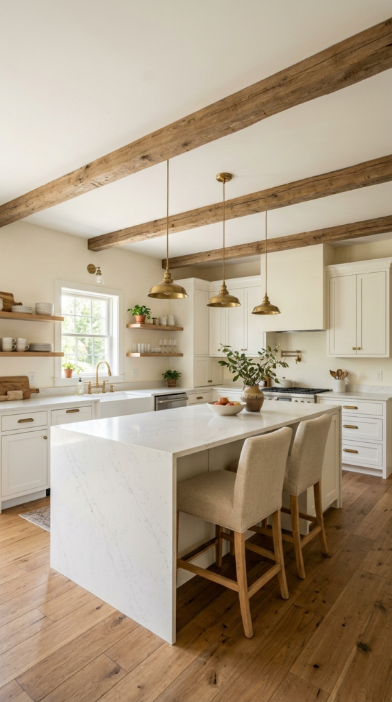
Exposed Wood Beams
- Adds warmth and texture to a flat white ceiling.
- Draws the eye upward and makes the room feel taller.
- Lightweight faux beams give the look without heavy lifting.
- Pairs beautifully with white cabinets and brass lighting.
Look up, because the ceiling is the most overlooked surface in the room. Wood beams add warmth, height, and character that flat white paint simply can’t deliver. Real reclaimed timber feels rustic and storied, while lightweight faux beams give the same look with easier installation. Run them across the room to emphasize its width, or along the length to make it feel longer. Pair warm wood with white cabinets and brass lighting, and the whole space feels cozy and collected. Even two or three slim beams over an island create a welcoming focal point that guests notice right away.
Ceiling height and weight are the details to check first. I’ve seen this work well in many homes with ceilings of nine feet or more, since lower rooms can feel crowded by deep beams. Choose hollow faux beams for easy mounting, or ask a contractor to confirm joist locations before attaching real timber. Stain the wood a warm medium tone, and keep the surrounding ceiling bright white for contrast. Add small spotlights along the beam so light grazes the grain. You will notice the room feels taller, warmer, and more inviting, and the ceiling becomes a design feature.
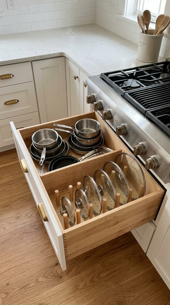
Deep Drawer Storage
- Lets you see every pan from above instead of digging in the dark.
- Full-extension slides carry heavy cast iron with ease.
- Saves your back by cutting down on bending and reaching.
- Dividers keep lids and pans from sliding around.
Bending and digging through dark cabinets gets old fast, and deep drawers fix it. Instead of stacking pots in a back corner, a wide drawer lets you see every pan from above and lift out exactly what you need. Heavy cookware, mixing bowls, and small appliances all glide out smoothly on full-extension slides. Soft-close mechanisms keep everything quiet and protect your fingers. Choose drawers in place of lower doors beside the range, and cooking feels faster and more comfortable. The result is a tidy, ergonomic setup that saves your back and makes every cabinet space genuinely useful.
Details inside the drawer decide how well it works. In my experience, adjustable wooden dividers and peg organizers keep lids, plates, and pans from sliding around every time you open it. Choose slides rated for at least a hundred pounds, since cast iron adds up quickly. Place the deepest drawer near the stove for pots and the shallower ones near the sink for utensils. Line the bottoms with non-slip mats to reduce noise. You will notice less bending, fewer lost lids, and a calmer cooking routine, because every item finally has a clear, reachable place to live.
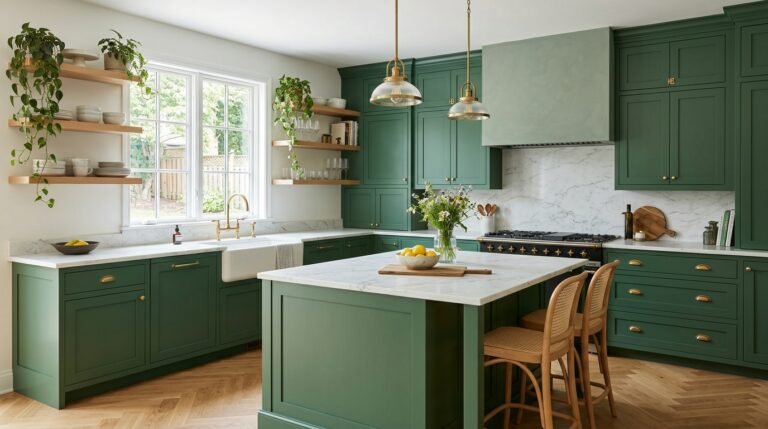
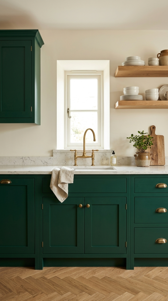
Emerald Green Cabinets
- Adds richness and personality that white cabinets can’t match.
- Green feels natural, so the bold color stays calming.
- Brass hardware and warm wood make the shade glow.
- Works as a full kitchen or just on the island.
Bold color is the fastest way to give a kitchen personality. Deep emerald cabinets bring richness and drama that white simply can’t match, yet they still feel natural because green belongs in every home. Pair them with warm brass hardware and creamy walls, and the room looks elegant and welcoming. Natural wood shelves and a marble-look countertop soften the intensity beautifully. Even if you only paint the island or the lower run, the effect is striking. The finished space feels confident, cozy, and full of character, like a room designed by someone who truly loves color.
Choosing the right shade takes a little testing. I’ve noticed that green looks very different in morning and evening light, so paint large sample boards and tape them to the cabinets for a few days. Pick a satin or semi-gloss cabinet enamel for durability, and choose a green with a slight gray or blue undertone for a timeless feel. Repeat the color in a small way, such as a plant or tea towel. You will notice the room gains depth, natural light plays beautifully across the finish, and the kitchen feels rich, grounded, and wonderfully personal.
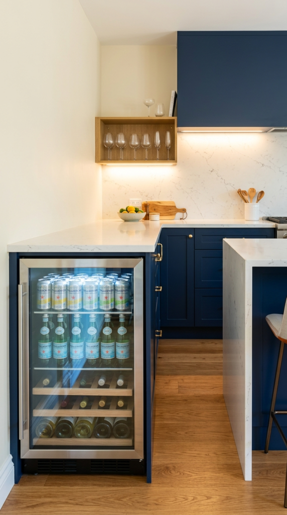
Beverage Fridge Nook
- Keeps drinks out of the main fridge, so groceries have more room.
- Moves traffic away from the cooking zone.
- Glass door and soft lighting add a boutique-style touch.
- Turns a corner into a mini entertaining station.
Imagine grabbing a cold drink without ever opening the main refrigerator. A built-in beverage nook gives drinks their own home, so the main fridge stays free for groceries and guests stop crowding the cooking zone. An under-counter drink fridge fits neatly beside the island or near the dining area. Add a small shelf for glasses and a tray for bottle openers, and the corner becomes a mini entertaining station. The result is a smart, stylish zone that keeps traffic flowing and makes hosting feel relaxed, organized, and effortless for the whole family.
Ventilation and placement are the details to get right. That’s why many designers recommend choosing a model rated for built-in use, since it vents from the front instead of the back. Leave the manufacturer’s recommended clearance, and place the unit near an outlet so the cord stays hidden. Stock it with sparkling water, juice boxes, and wine, and add a small glass-front section for presentation. Under-cabinet lighting makes bottles glow after dark. You will notice fewer kitchen traffic jams, a tidier main fridge, and a gathering spot that feels fun, polished, and ready for parties anytime.
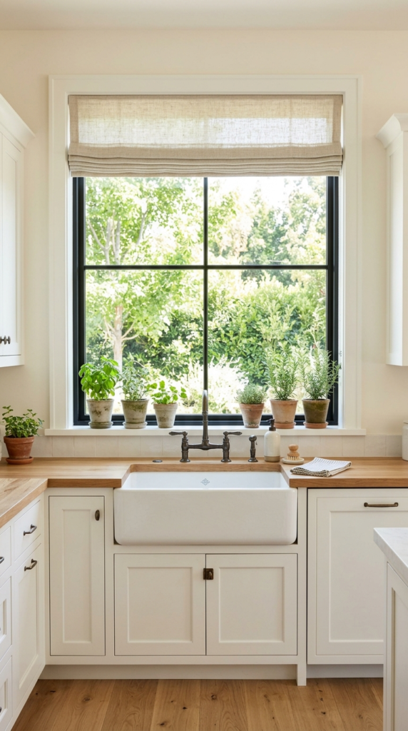
Oversized Picture Window
- Floods the room with daylight and lowers lighting needs.
- Frames the garden like a living picture.
- A deep sill gives space for herbs and small plants.
- Makes the room feel larger and calmer.
Natural light is the one upgrade money can’t fake. An oversized window above the sink or beside the dining area floods the room with daylight and frames the garden like living art. Slim black or white frames keep the view clean, while a deep sill gives space for herbs and small pots. Even a modest increase in glass makes the room feel larger and calmer. The result is a bright, open space that feels connected to the outdoors and makes every ordinary morning feel a little more special and memorable for everyone at home.
Structure and glass choices affect comfort year-round. I’ve seen this work well in many homes when the window uses double-pane low-E glass, which reduces heat and glare while keeping the view crisp. Ask a contractor to check the wall before enlarging an opening, since a new header may be required to carry the load above. Add light linen shades that pull up completely, so privacy is easy without blocking daylight. Keep the sill clear to prevent condensation. You will notice brighter mornings, lower lighting needs during the day, and a kitchen that feels airy, fresh, and wonderfully open.
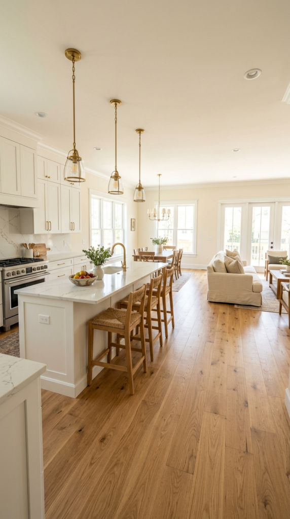
Open Layout Flow
- Lets the cook stay part of the conversation.
- Daylight travels freely from room to room.
- A long island works as a soft divider with seating.
- Matching floors and colors keep everything cohesive.
Walls come down, and suddenly the whole home feels bigger. An open layout connects the kitchen to the living and dining areas, so cooks stay part of the conversation and light travels freely from room to room. A long island acts as a soft divider, offering seating on one side and prep space on the other. Matching floors and a consistent color palette keep everything cohesive. The result is a welcoming, social space where family and guests move easily, and everyday life feels connected, relaxed, and far more enjoyable than a closed-off room.
Open plans need smart planning, though. In my experience, the biggest surprise is noise and cooking smell, so choose a quiet, powerful range hood and soft rugs or upholstered stools to absorb sound. Always have a structural engineer confirm whether a wall is load-bearing before removal, since a beam may be needed. Define zones with lighting, such as pendants over the island and a lamp in the living area. Keep a small pantry or closed cabinets nearby to hide clutter. You will notice more daylight, easier entertaining, and a home that feels spacious, connected, and genuinely inviting.
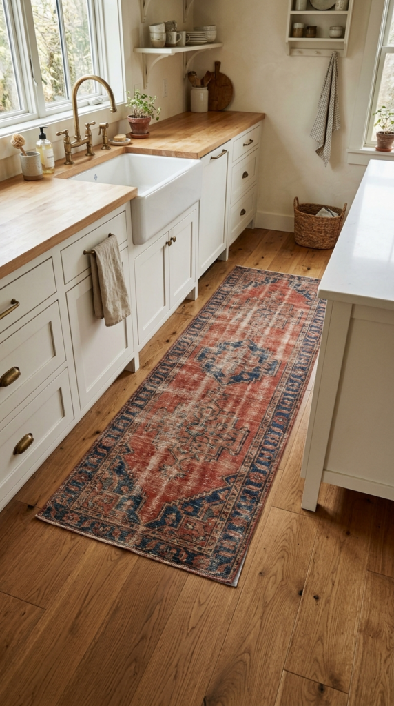
Vintage Runner Rug
- Adds color, pattern, and softness underfoot.
- Faded patterns hide crumbs and footprints.
- Breaks up large areas of wood or tile.
- Washable low-pile styles stay practical.
A single rug can make a hard-surfaced kitchen feel like a warm hug. A vintage-style runner adds color, pattern, and softness underfoot, especially in front of the sink or along the island. Faded reds, blues, and creams hide crumbs and footprints beautifully, which makes them perfect for busy homes. The pattern also breaks up large areas of wood or tile and adds a collected, lived-in charm. Choose a low-pile, washable style, and the runner becomes both pretty and practical, turning a plain walkway into a cozy, characterful part of the room.
Safety and size matter more than most people expect. I’ve noticed that a non-slip rug pad is essential, since loose rugs on smooth floors are a common cause of slips. Leave about six to eight inches of bare floor on each side of the runner so the room doesn’t feel crowded. Pick a low pile that slides under appliances and doors without catching. Shake it out weekly and spot-clean spills right away. You will notice quieter footsteps, a more comfortable standing spot while you cook, and a kitchen that feels softer, warmer, and thoughtfully layered.
Conclusion
A beautiful kitchen does not happen all at once. It grows from small, thoughtful choices that add warmth, light, and function to the space you use every day. Whether you love the drama of deep green cabinets, the glow of statement pendants, or the calm of a clutter-free counter, there is something here that fits your style. I’ve seen how small changes like these can completely transform a space. Save this post on Pinterest, try one or two kitchen remodel ideas in your own home, and share the article with a friend who is dreaming of a fresh start.