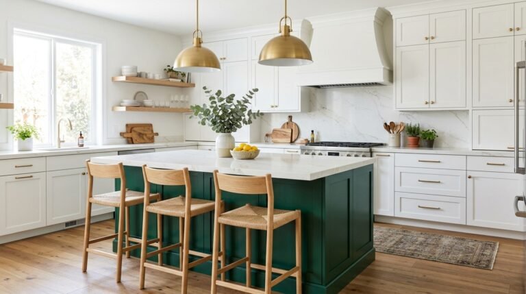
Tiny kitchen, big dreams? You are not alone. These small kitchen ideas modern homeowners love prove that a compact space can look sleek, feel open, and still hold everything you need.
Cramped counters, dark corners, and cluttered cabinets are the most common complaints I hear about small kitchens. In my experience, the fix is rarely a bigger room. It is smarter storage, lighter colors, and a few well-chosen details. Below you will find 17 simple ideas, from handleless cabinets and warm wood accents to under-cabinet lighting and floor-to-ceiling storage. Each one includes practical tips you can try in a rental or a renovation. Scroll through, save your favorites to Pinterest, and start planning a kitchen that works as beautifully as it looks.
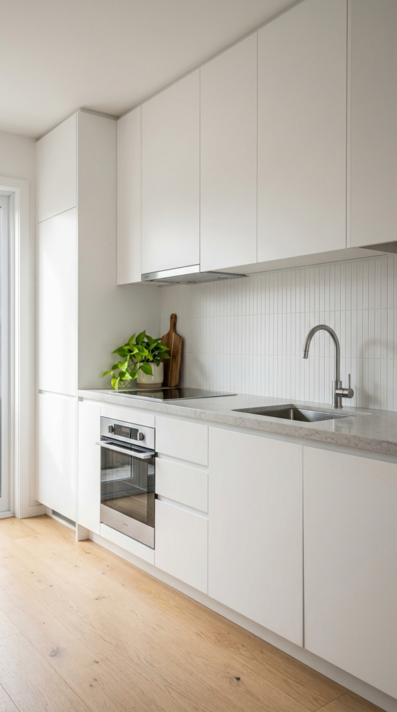
White Handleless Cabinets
- Flat-front doors remove visual clutter, so the room reads as one calm surface.
- Push-to-open or finger-pull edges save the few inches that handles would steal.
- A single color makes tight walls look further away.
- Wipes clean in seconds, which matters when every counter gets used daily.
Clean lines can make a tiny room breathe. Handleless white cabinets remove the little bumps and hardware that chop up a wall, so your eye travels smoothly from one end to the other. Choose flat-front doors with push-to-open latches or a slim finger groove, and keep the countertop a soft gray for gentle contrast. I’ve noticed that a compact kitchen with fewer visible details feels calmer and looks larger, even when the measurements stay exactly the same. It is a simple upgrade that suits rentals, apartments, and city homes where every inch has to work hard.
Want the finish to look high-end without a huge budget? Stick to one matte white shade across doors, drawers, and the backsplash, then add a built-in oven or integrated fridge panel to hide bulky appliances. Light bounces off the smooth surfaces, which brightens the whole space during the day. Cleaning becomes easier too, because there are no grooves or handles collecting grease. Finish the look with a single green plant and an uncluttered counter. The result is a sleek, modern workspace that feels organized, spacious, and calm, and it still leaves room for personality through small, thoughtful accessories.
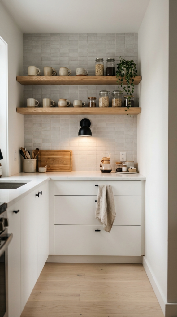
Floating Open Shelves
- Replaces bulky upper cabinets, so the wall feels open instead of boxed in.
- Keeps daily mugs, plates, and jars within easy reach.
- Light oak adds warmth to a white and gray palette.
- A small wall lamp turns the shelf into a soft glowing feature.
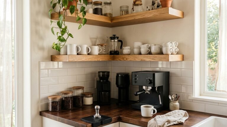
Heavy wall cabinets can make a small kitchen feel like a tight box. Floating shelves flip that feeling instantly. Swap one run of uppers for two slim oak boards, then style them with white mugs, glass jars, and a small plant. I’ve seen this work well in many apartments, because the open space above the counter lets light travel further across the room. The shelves also keep your everyday items easy to grab, which cuts down on cabinet clutter. Keep the arrangement edited, and the wall will look intentional, modern, and welcoming rather than crowded or messy.
Styling is where open shelving succeeds or fails. Limit yourself to two or three materials, such as ceramic, glass, and wood, and repeat one color so the display feels cohesive. Mount the boards about 18 inches above the counter, and leave a few inches of breathing room between objects. A small matte black wall lamp adds a soft glow in the evening and makes the corner feel special. The result is a bright, airy cooking zone that looks designed, not stuffed. Remember to wipe the shelves weekly, since dust and grease show up faster on open surfaces.
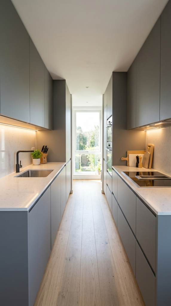
Slim Galley Layout
- Two parallel runs give you maximum storage in a narrow footprint.
- A window at the far end pulls the eye forward and brightens the corridor.
- Under-cabinet LEDs light the work surface without taking up space.
- The classic work triangle stays short, so cooking takes fewer steps.
Some of the smartest kitchens are only a few steps wide. A galley layout places cabinets on two parallel walls, which keeps the sink, hob, and fridge within easy reach. Cooks often love this setup, because everything is close, the steps between tasks are short, and nothing gets in the way. Aim for a walkway of about 1.2 meters so two people can pass comfortably. Matte gray cabinets with white quartz counters keep the look modern and tidy. It is one of the most efficient layouts for a compact modern kitchen, especially in long, narrow rooms.
Light and storage decide whether a narrow kitchen feels cramped or clever. Run LED strips under the upper cabinets so the counters stay bright, even on gloomy evenings. Place a window or glass door at the far end to pull the eye forward and make the corridor feel longer. Choose tall cabinets on one side for pantry items, and keep the opposite side lower for prep space. The result is a streamlined, efficient room with a clear path and plenty of storage. Keep the floor a light wood tone, and the whole space will feel wider and more inviting.
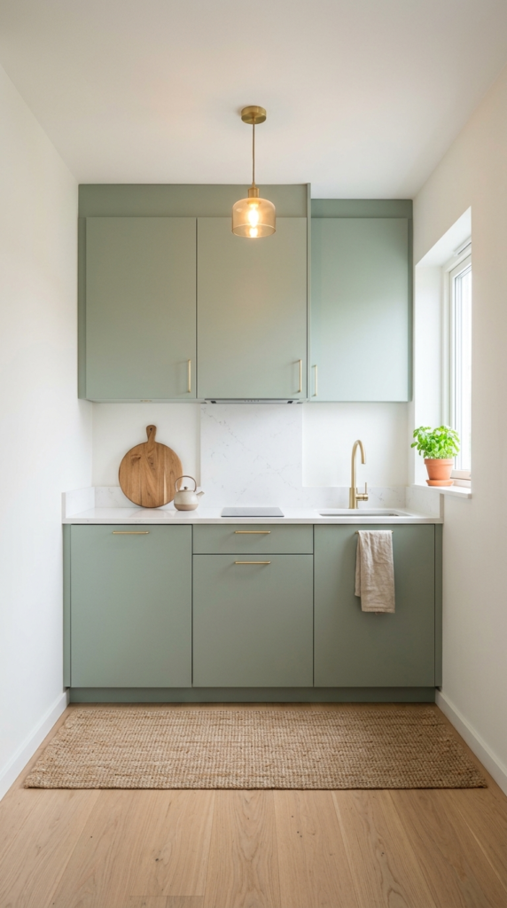
Sage Green Cabinets
- Muted green adds color without making tight walls feel heavy.
- A matte finish hides fingerprints and looks soft in photos.
- Brass pulls add a small touch of warmth.
- Pairs easily with white counters and light wood.
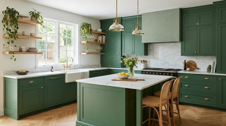
Color can make a small kitchen feel bigger, not smaller. Sage green cabinets bring a soft, natural tone that feels calm and current, especially when paired with white walls and light wood accents. Many people fear color in a tight space, but muted shades reflect light and keep the room gentle on the eyes. I’ve noticed that sage looks good in both morning sun and evening lamplight, which is rare. Choose a matte finish to hide fingerprints, and add brushed brass pulls for a little warmth. It is a fresh way to bring personality into a modern, compact room.
Pairing matters as much as the paint. Keep the countertop white or light gray, and let the backsplash stay simple so the green remains the star. Add a light oak floor or a woven runner to bring in texture, and place a small herb pot near the window for a living touch. Natural daylight makes sage glow, while warm bulbs soften it at night. The result is a kitchen that feels fresh, grounded, and welcoming. Test a sample on the wall for a few days first, since the shade shifts with your lighting.
please also read: 18bloxburg kitchen ideas
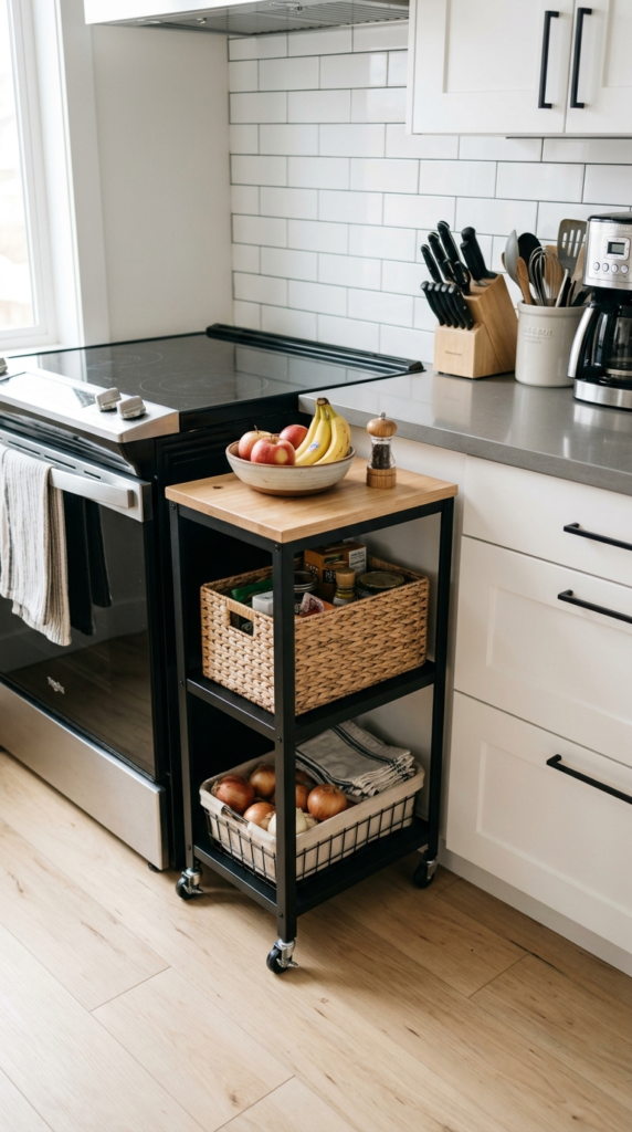
Slim Rolling Cart
- Adds prep space without a permanent island.
- Tucks away easily when you need a clear walkway.
- Baskets on the lower shelf hide small appliances.
- No drilling or installing, so it suits rentals.
Need extra counter space without a permanent island? Roll one in. A slim cart on wheels gives you a prep surface, a storage shelf, and a spot for a coffee station, then tucks away when guests arrive. I’ve seen this work well in rentals, because nothing needs drilling or installing. Choose a cart with a wood top and a matte black or white frame so it blends with modern cabinets. Look for locking wheels and a width of about 40 centimeters, which slides into most gaps. It is flexible, affordable, and surprisingly stylish.
Styling the cart keeps it from looking like an afterthought. Use the top shelf for cutting boards and a fruit bowl, and the lower shelf for baskets that hide small appliances. Hooks on the side can hold towels or utensils, which frees up drawers. Keep colors consistent with your cabinets, so the cart feels built in rather than borrowed. When you’re cooking, roll it beside the stove for extra prep room, and push it back to restore your walkway. The result is a modern, flexible kitchen that adapts to your day instead of forcing you to adapt to it.
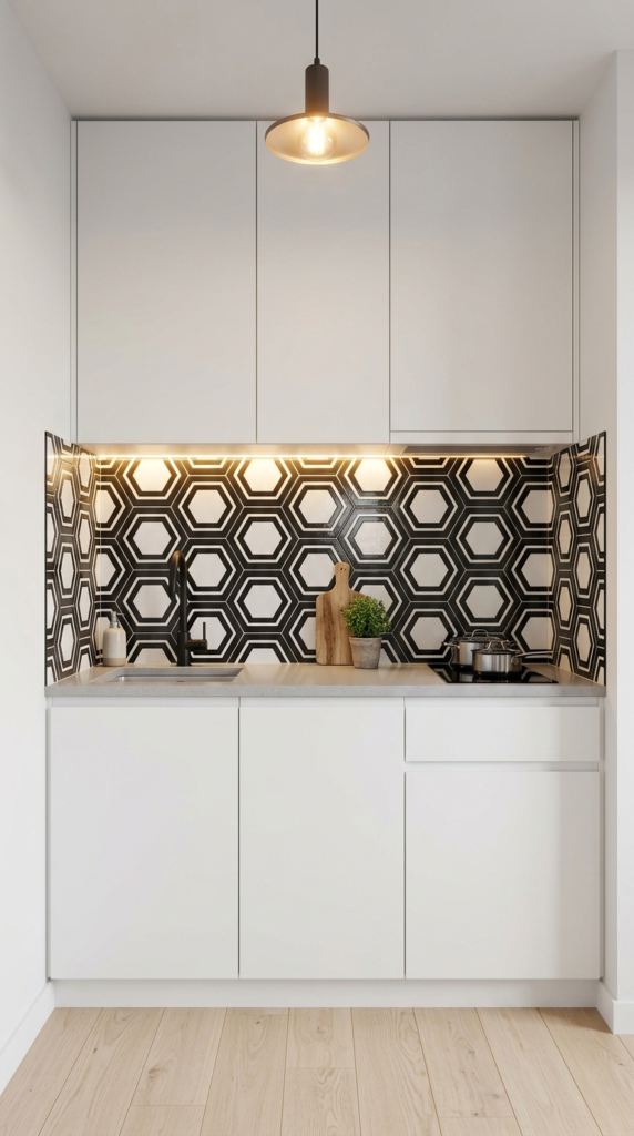
Bold Geometric Backsplash
- One patterned wall becomes the focal point of the whole room.
- Plain cabinets keep the design clean and balanced.
- Glazed tile wipes clean easily behind the cooktop.
- Takes up zero floor space, so it is ideal for tiny rooms.
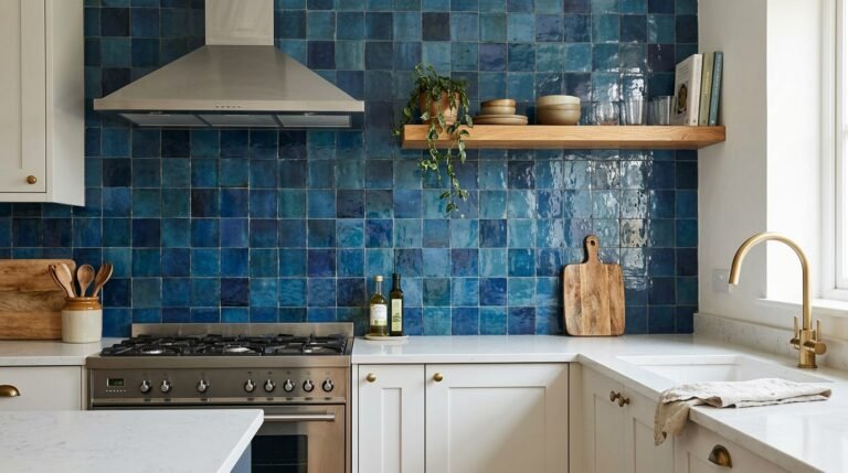
Sometimes one bold wall is all a tiny kitchen needs. A geometric backsplash, like hexagons or a black-and-white pattern, adds energy and becomes the focal point without taking any floor space. Keep cabinets and counters plain so the pattern stands out. I’ve noticed that people who worry about busy walls often love the result, because the rest of the room stays quiet. Choose tiles in two or three colors, and use a matching grout so the design looks crisp and clean. Limit the pattern to the area behind the sink and stove for the strongest impact.
Pattern works best when everything else stays calm. Pair the tiles with white or soft gray cabinets, a simple faucet, and one warm light above the sink. Under-cabinet lighting makes the tile surface shimmer in the evening, so the design reads clearly even in a narrow room. Glazed ceramic wipes clean easily, which helps behind a busy cooktop. Among all small kitchen ideas modern homeowners try, this one gives the biggest visual return for the smallest area. The result is a stylish, memorable kitchen that feels designed, practical, and full of character without any extra clutter.
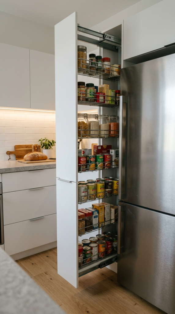
PullOut Pantry Drawer
- Turns a thin, wasted gap into a full storage tower.
- Everything slides out, so nothing gets lost at the back.
- A matching front blends in with the other cabinet doors.
- Keeps counters clear, which makes the room look calmer.
Hidden storage is a small kitchen’s best-kept secret. A slim pull-out pantry slides into a gap as narrow as 15 centimeters, turning dead space beside the fridge into a tall storage zone for oils, spices, and cans. That’s why designers love it for rentals and renovations alike: it fits where regular cabinets cannot. Choose a matte white or light gray front so it blends with the surrounding doors. Everything becomes visible at a glance, which means fewer duplicate purchases and less digging. It is a practical upgrade that keeps counters clear and the whole room looking calm and organized.
Installation is simpler than most people expect. Measure the gap between the fridge and the wall, then choose a unit with full-extension runners and a soft-close mechanism. Wire baskets or wooden shelves both work well, and adjustable heights let you store tall bottles on one level and small jars on another. Keep heavier items low to protect the runners. The result is a tidy, modern kitchen where nothing hides at the back of a cupboard. Label the baskets if you share the space, and everyone will know exactly where things belong.
Warm Wood Accents
- Wood softens a white and gray palette instantly.
- One or two pieces are enough, so the room never feels heavy.
- Black hardware adds a crisp, modern contrast.
- Butcher-block doubles as a practical chopping surface.
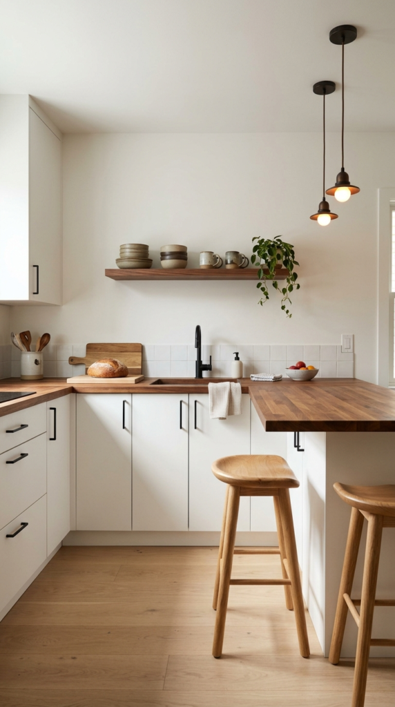
White and gray can start to feel cold, and wood fixes that fast. Warm wood accents, like a walnut shelf, oak stools, or a butcher-block counter, add texture and comfort to a sleek compact kitchen. I’ve noticed that one or two wooden pieces are enough, since too many can make a tight room feel heavy. Match the undertones so the tones look related rather than random. Pair them with matte white cabinets and black hardware for a crisp contrast. It is an easy way to make a modern space feel welcoming instead of showroom-perfect.
Start with the surface you touch most. A butcher-block counter section adds warmth where your hands land, and it doubles as a chopping area. Then repeat the wood once more, perhaps in a floating shelf or a pair of stools, so the look feels planned. Seal the wood with food-safe oil every few months to protect it from water. Soft daylight brings out the grain beautifully, while warm bulbs make evenings feel cozy. The result is a balanced, inviting kitchen that stays modern, bright, and practical without losing its personality or feeling too cold.
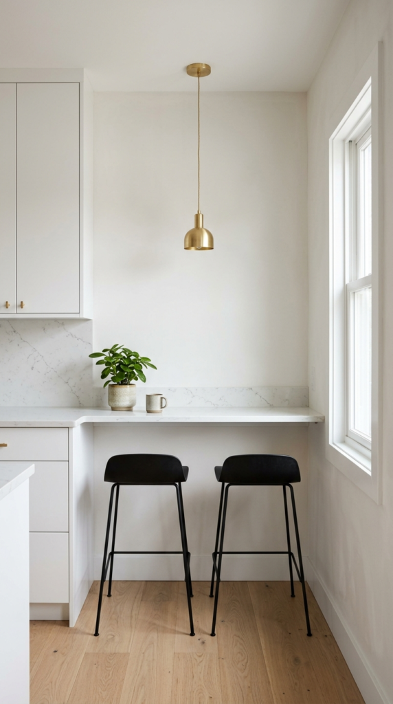
Corner Breakfast Bar
- Replaces a bulky dining table with a slim counter.
- Slim stools tuck away, so the walkway stays open.
- A pendant light marks the zone without adding walls.
- Works for breakfast, laptop time, or evening drinks.
No room for a dining table? Build a breakfast bar instead. A slim counter along one wall, about 35 centimeters deep, gives you a spot for coffee, laptop time, or quick meals. In my experience, this works well in studio apartments, because it replaces a bulky table with something that disappears into the design. Choose a wood or white quartz top that matches your counters, and tuck two slim stools underneath. When you finish eating, push the stools in, and the corner looks tidy again. It is a clever way to add seating without losing space.
Position the bar where light is best, ideally beside a window. Hang one small pendant above it to mark the zone, and add a couple of hooks underneath for bags. Choose stools with slim legs so the floor stays visible, which keeps the room feeling larger. Leave about 60 centimeters per person for comfortable seating. The result is a multi-use corner that works for breakfast, homework, and evening drinks. Keep the surface clear except for one small plant or lamp, and it will always look styled, modern, and ready for guests or a quiet morning alone.
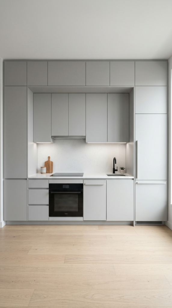
Integrated Appliance Fronts
- Cabinet panels hide bulky appliances, so the wall reads as one clean surface.
- Fewer visible edges make a compact room feel wider.
- A single handleless style keeps the look calm and consistent.
- Removes the shiny stainless clutter that breaks up a soft palette.
Hide the bulky stuff and the whole wall changes. Integrated appliance fronts place cabinet panels over the fridge, dishwasher, and even the freezer, so everything looks like one smooth run of doors. I’ve seen this work well in compact apartments, because visual noise disappears and the room feels wider. Choose panels in the same matte finish as your cabinets, and keep gaps small and even. Hidden appliances also reduce the shiny stainless clutter that breaks up a clean palette. It is a polished upgrade for anyone who wants a sleek modern kitchen that looks bigger than its footprint.
Planning matters more than budget here. Measure each appliance carefully, then ask for ventilation gaps so the fridge can breathe. Use a single handleless style across all panels, and add a slim light rail underneath to keep the counter bright. The cooker hood can disappear into a cabinet too, which keeps the wall clean. Good ventilation protects your appliances, so never skip it. The result is a quiet, seamless kitchen where nothing competes for attention. Finish with a light stone counter and one simple accessory, and the room will feel calm, modern, and thoughtfully organized.
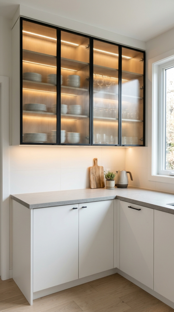
Glass Cabinet Doors
- Transparent doors add depth where solid fronts would feel heavy.
- One or two glass units give you display space without open-shelf mess.
- Ribbed or frosted glass softens clutter while keeping the airy effect.
- Slim black frames add a crisp modern edge.
A little transparency can make a small wall feel lighter. Glass-front cabinets let the eye travel through the doors, which adds depth where solid fronts would feel heavy. Use them for just one or two upper units, and fill them with white plates, simple glasses, or neat jars. In my experience, ribbed or frosted glass is easier to live with, because it softens clutter while keeping the airy effect. Pair the glass with slim black frames for a crisp modern edge. It is a smart way to add display space without turning the whole room into open shelving.
Lighting makes glass doors shine. Install a small LED strip inside the cabinet so the contents glow softly at night, and choose a warm white tone for comfort. Keep the shelves inside tidy by sticking to one color family, such as white and clear glass. Place the glass unit near the window or above the sink, where light can bounce through it. The result is a bright, layered wall that feels designed rather than crowded. Clean the glass with a microfiber cloth every week, and the display will keep that fresh, polished look without much effort at all.
Matte Black Fixtures
- Black pulls and a faucet add sharp contrast to white and gray.
- Three or four pieces are enough to look styled.
- Easy to swap in rentals and take with you later.
- A light base keeps the dark accents from feeling heavy.
Small details can sharpen a whole room. Matte black fixtures, like a faucet, cabinet pulls, and a slim wall light, add crisp contrast to white and gray kitchens. I’ve noticed that three or four black pieces are enough to make a compact space look styled, while too many can feel heavy. Repeat the finish in at least two places so it looks planned. Choose solid, well-coated pieces, since cheap paint can chip with daily use. It is an affordable upgrade that works in rentals too, since faucets and pulls can be swapped and kept for the next home.
Contrast works best when the base stays light. Pair the black hardware with white cabinets, a pale counter, and a simple tile backsplash. Add one black wall lamp or a framed print to echo the finish across the room. Natural daylight keeps the black from feeling harsh, while warm bulbs soften it in the evening. The result is a clean, graphic look that feels modern without being cold. Wipe fixtures with a soft damp cloth after cooking, and dry them, so mineral marks never build up. A few smart touches are all this compact kitchen needs to feel finished.
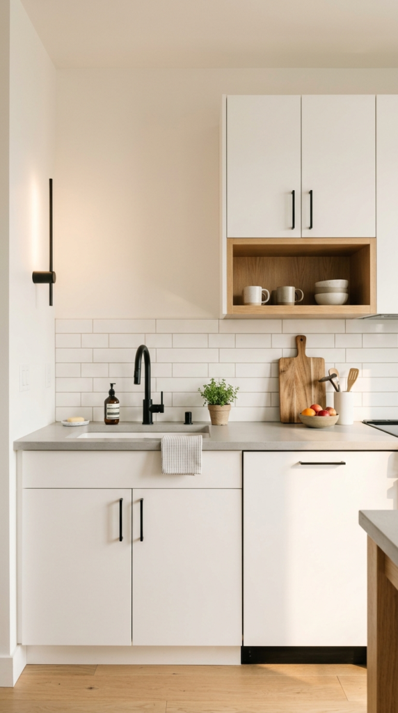
Under Cabinet LED Glow
- Lights the exact spot where you chop, pour, and read recipes.
- Removes the shadow your own body casts from overhead lights.
- Dimmable strips switch the room from prep mode to evening mood.
- Needs no wall space, so it suits even the tiniest layouts.
Shadows are the enemy of a small kitchen. Under-cabinet LED strips wash light straight onto the counter, so chopping, reading recipes, and cleaning up all feel easier. I’ve noticed that overhead lights alone cast your own shadow across the work area, which makes the room feel smaller and darker. Choose a warm white tone around 3000K for comfort, and tuck the strip behind a small front lip so you never see the bulbs. It is a quick upgrade that suits rentals with plug-in options and renovations with hardwired kits, and it changes the mood instantly.
Placement makes the difference between a glow and a glare. Mount the strip close to the front edge of the cabinet, so light falls on the counter rather than reflecting off the backsplash. Add a dimmer or a motion sensor, and the kitchen can shift from bright prep mode to a soft evening mood with one touch. Matte backsplash tiles reduce hot spots, while glossy ones bounce light around. The result is a countertop that looks brighter, a wall that feels deeper, and a room that seems larger after dark. Wipe the cover monthly.
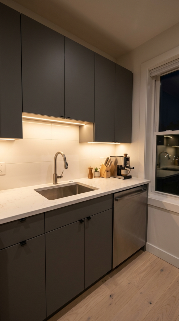
Wall Rail Storage
- Moves tools off the counter and onto an unused wall strip.
- Hooks keep everyday items within reach while you cook.
- Frees up drawer and cabinet space for bulkier things.
- A black or brass rail doubles as a design detail.
Your walls are free storage waiting to be used. A simple rail with hooks lifts utensils, mugs, and small pots off the counter, which clears space for actual cooking. In my experience, a compact kitchen feels twice as usable once the whisks and ladles hang within reach. Choose a matte black or brushed brass rail that matches your faucet, and mount it beneath a shelf or beside the hob. Most rails install with two screws, and many use adhesive mounts for rentals. It is a small project with a big payoff for any modern, compact cooking space.
Styling a rail is about restraint. Hang only the tools you reach for daily, such as a spatula, a ladle, and two mugs, and keep the rest in drawers. Repeat one or two colors so the display feels planned, and leave gaps between items so nothing swings into each other. Add a small herb pot on the counter below for fresh color. The result is a wall that works hard and looks tidy, with everything you need right where your hand lands. Wipe the hooks and tools weekly, because grease collects faster on open storage near the hob.
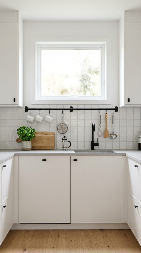
Large Format Floor Tile
- Fewer grout lines make the floor look larger and calmer.
- Light gray reflects daylight and brightens a tight room.
- Porcelain resists stains, water, and daily scuffs.
- Easy to mop, since there are fewer joints to scrub.
Look down, and you might find the secret to a bigger room. Large format tiles, such as 60 by 60 centimeters, create fewer grout lines, so the floor reads as one calm surface. I’ve seen this work well in narrow kitchens, because the eye travels without stopping and the space seems wider. Choose a light gray or warm stone tone in a matte finish, which hides footprints and reduces glare. Porcelain is durable, water resistant, and easy to maintain. It is a practical flooring choice for compact modern kitchens that need to look larger and still handle wear.
Installation details matter here. Ask your installer for thin grout lines in a color that matches the tile, and make sure the subfloor is perfectly level, since large tiles show every dip. Run the tiles in the same direction as the longest wall to stretch the room visually. Continue the same flooring into the next room if you can, which removes a visual break at the doorway. The result is a floor that feels clean, spacious, and modern. Seal the grout once a year, and a quick mop is all you need to keep it fresh.
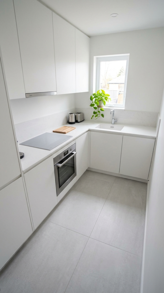
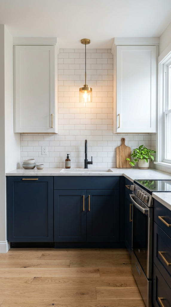
Two Tone Cabinets
- Dark lowers and light uppers add depth without shrinking the room.
- The pale top half keeps the walls bright and open.
- Dark color near the floor hides scuffs and splashes.
- Brass or black pulls tie both shades together.
Two colors can create depth in even the smallest room. Pair deep navy lower cabinets with white uppers, and the kitchen gains weight at the bottom while the top stays light and open. I’ve noticed that this split makes ceilings look higher, because the eye lifts toward the pale wall units. Keep the same flat-front style on both levels so the design stays modern and clean. Brushed brass or black pulls tie the colors together. It is a smart option for anyone who wants bold color without overwhelming a compact space, and it feels more custom than it costs.
Choose your split line carefully. Keep the darker shade on the lower cabinets, where scuffs and splashes happen most, and let the lighter color run up to the ceiling. A white quartz counter and a simple tile backsplash keep the transition crisp. Natural daylight makes navy look rich, while warm bulbs soften it in the evening. Test paint samples on the wall for a few days, since dark shades shift with lighting. The result is a kitchen with structure, personality, and balance, where the color feels intentional rather than heavy. Finish with a light oak floor for warmth.
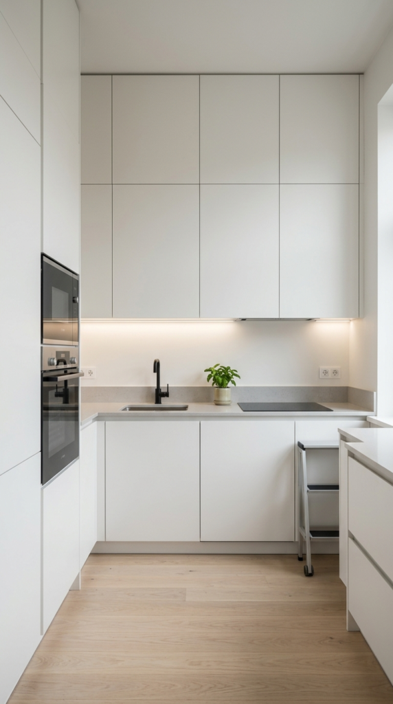
Floor to Ceiling Storage
- Full-height doors remove the dusty gap above wall cabinets.
- Extra shelves hold rarely used items out of sight.
- One flat color makes the tall wall look like a single calm surface.
- Adds storage without adding a single square meter.
Use every inch, even the ones above your head. Full-height cabinets run storage all the way to the ceiling, which removes the dusty gap where clutter and grease usually collect. In my experience, a compact kitchen gains noticeably more storage this way. Keep the top shelves for items you rarely use, such as party platters and seasonal gear. Choose flat matte fronts in a single color so the tall wall reads as one calm surface. It is one of the most effective small kitchen ideas modern homeowners can use to gain space without adding square footage.
Access is the key detail. Add a slim step stool or a rolling ladder, and keep daily items between knee and shoulder height. Use deep drawers for pots and tall pull-out units for pantry goods, so nothing hides at the back. Soft-close hinges protect the doors, and a light strip inside the highest cabinets helps you see what you are reaching for. The result is a clean, uninterrupted wall that holds a surprising amount while looking minimal and modern. Paint the wall behind the cooker the same shade as the cabinets, and the room feels taller, calmer, and organized.
Conclusion
A small kitchen does not have to feel small. With light colors, hidden storage, warm wood, and smart lighting, even a narrow room can feel open, calm, and stylish. Whether you loved the bold backsplash or the quiet charm of sage green, these ideas show how simple changes create a big difference. I’ve seen how small updates like these can completely transform a space. So save this post on Pinterest, try one idea in your own kitchen this weekend, and share it with a friend who is planning a refresh. Your best kitchen yet is closer than you think.