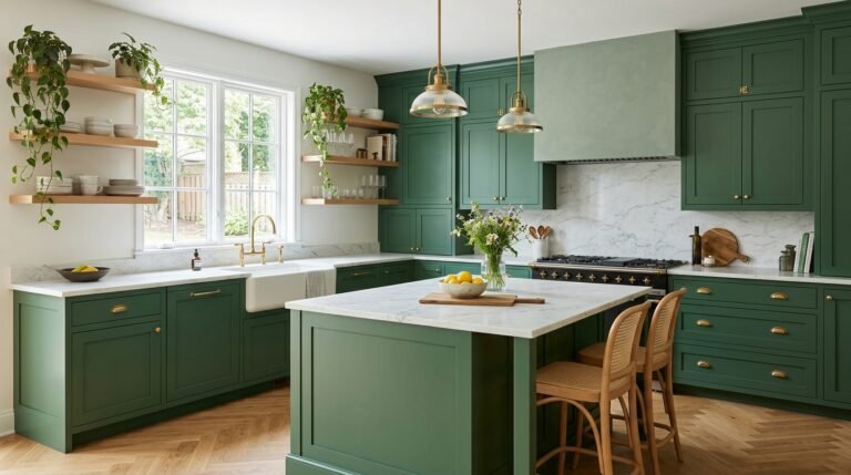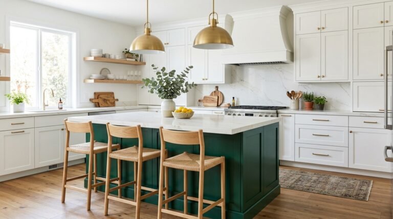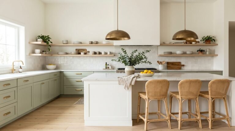
Imagine stepping into a kitchen that instantly feels calm, fresh, and full of personality. That is the magic of a blue kitchen, and it is easier to create than you think. Maybe your space feels flat, too white, or just a little forgotten. A touch of blue can change that quickly. I’ve noticed that people often fear color until they try it in small doses, like a painted island or a tile wall. Inside, you’ll find 18 visual, practical ideas for every budget and layout, from soft pastels to deep navy. Save your favorites and get ready to fall in love with your kitchen again.
Navy Cabinet Classics
- Adds instant depth and richness without extra decor
- Brass handles bring a warm, polished contrast
- White counters keep the deep color from feeling heavy
- Satin finishes make everyday cleaning easy
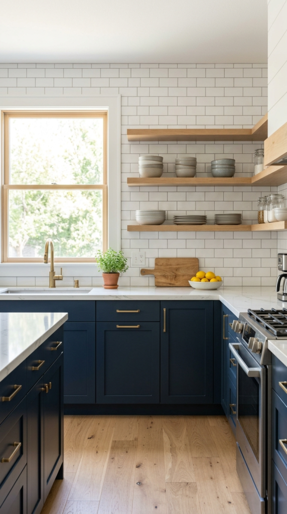
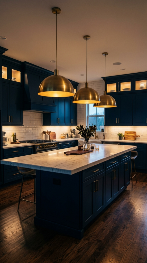
Navy cabinets are the quiet showstopper that never goes out of style. Deep blue brings richness without making a room feel heavy, especially when paired with white counters and warm metal handles. In real homes, this combination hides smudges better than pale cabinets and gives the kitchen a grounded, confident look. I’ve noticed that navy also works beautifully in small spaces, because the color recedes and makes walls feel further away. Choose a satin finish for easy wiping, and let natural daylight bounce off the surface. The result is a polished, welcoming room that feels expensive without trying.
Want a kitchen that feels designed rather than just decorated? Start with the lower cabinets in navy and keep everything else light and simple. Brass or matte black pulls add a sharp finishing touch, while a white marble-look counter keeps the palette fresh. The contrast draws the eye straight to the cabinetry, so even a modest layout feels intentional. That’s why many designers recommend navy as a first step into bold color. You’ll notice how the room feels calmer, cleaner, and more balanced, especially in the evening when warm pendant lights make the deep blue glow softly.
Soft Sky Backsplash
- Adds color exactly where the eye naturally lands
- Glossy tiles reflect light and brighten the cooking area
- Peel-and-stick tiles make it renter-friendly
- Pairs easily with white cabinets and natural wood
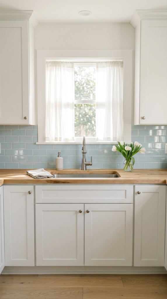
Sometimes the smallest change makes the biggest difference. A pale blue backsplash adds color exactly where the eye naturally lands, without overwhelming the room. Glossy tiles catch daylight and scatter it across the wall, which makes the whole cooking area feel brighter and more open. In my experience, this is the easiest way to try blue in a rented or budget-friendly kitchen, since peel-and-stick tiles can do the job in one afternoon. Pair the soft shade with white cabinets and light wood, and the space instantly feels breezy, clean, and gently cheerful from morning coffee to late dinner.
Think of the backsplash as the kitchen’s soft focal point. Because it sits between counters and cabinets, it frames the cooking zone like a piece of wall art. Sky-toned tile also pairs well with nearly every finish, from chrome faucets to wooden cutting boards. This works especially well in compact kitchens where a heavy color would feel too much. Choose a handmade-look tile with slight variation for charm, and use light grout to keep things airy. The final look is relaxed and cottage-inspired, with a calm glow that makes everyday cooking feel a little more special.
Two Tone Blue Cabinets
- Dark lower cabinets anchor the room
- Lighter uppers make the ceiling feel taller
- Gold hardware ties both shades together
- Scuffs and wear are less visible on the darker base
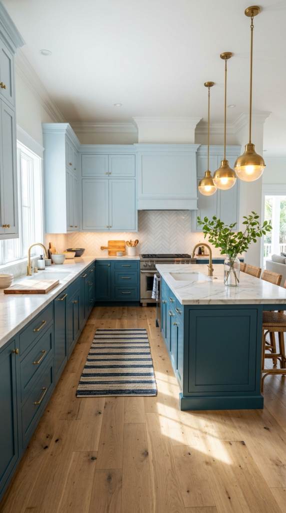
Why choose one shade when two can tell a richer story? Pairing a deep blue base with lighter upper cabinets gives the kitchen depth, balance, and a custom look. The darker color anchors the room, while the lighter tone keeps the eye moving upward and makes ceilings feel taller. This layered approach also hides wear on lower doors, where scuffs happen most. Add gold or brushed brass hardware to tie both shades together. The result feels collected and thoughtful, like a kitchen that evolved over time instead of being chosen from a single catalog page.
Ready to make a blue kitchen feel truly custom? Start by picking two shades from the same color family, one deep and one soft, so they blend rather than compete. Keep countertops white or lightly veined to let the cabinets shine. Warm pendant lights and a wood floor add cozy contrast against the cool tones. Designers often suggest this combination for open-plan homes, where the kitchen stays visible from the living area. You’ll notice a polished, coastal-inspired mood that feels calm during the day and beautifully moody once the evening lights come on.
please also read: 16 how high is a kitchen table
Statement Blue Island
- Creates one strong focal point without repainting the whole room
- Light surrounding cabinets keep the bold color balanced
- Rattan stools add warmth and texture
- Easy to repaint later if your taste changes
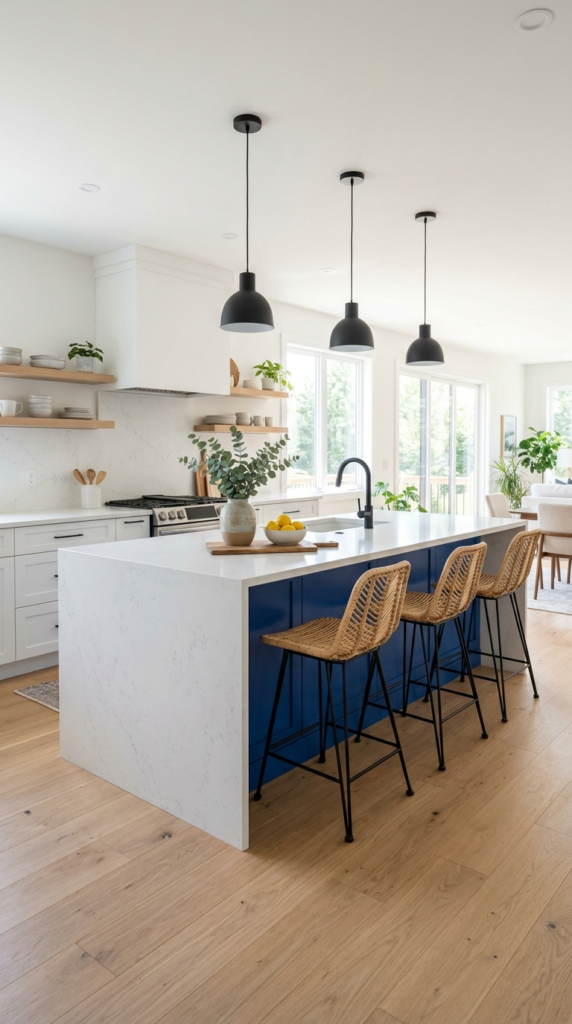
One bold island can change the entire personality of a room. Painting only the island in rich cobalt or deep teal gives you a strong focal point while the surrounding cabinets stay calm and light. It is the safest way to add color, because repainting a single piece is simple if your taste changes later. In my experience, guests naturally gather around the island, so the color becomes part of every conversation. Pair it with a white or light stone top, and the shade looks crisp instead of heavy. The kitchen instantly feels layered, social, and styled with purpose.
Want the island to feel like furniture instead of a block of cabinets? Add turned legs, a contrasting countertop overhang, and two or three woven stools. Warm wood or rattan softens the cool color and makes the seating area feel inviting. Hang pendant lights directly above, since their glow makes the paint look deeper at night. I’ve seen this work well in open-plan homes, where the island separates cooking from relaxing without adding walls. Keep the other finishes simple so the island stays the star. The final look is confident, balanced, and easy to love every day.
Blue Patterned Tile Floor
- Works like a built-in rug that never slips or fades
- Pattern makes narrow rooms feel wider
- Matte tiles grip better and hide crumbs
- Cream cabinets let the design stay the star
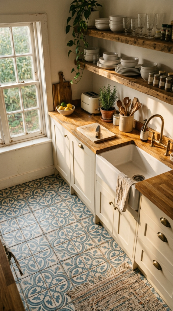
Look down, because the floor can be your boldest design move. Blue and white patterned tiles add personality to a kitchen that otherwise feels plain, and they work like a built-in rug that never slips or fades. The pattern draws the eye outward, which makes narrow rooms feel wider and more interesting. Cream or soft white cabinets let the tiles shine without clashing. Vintage-inspired designs in cobalt, navy, and pale aqua feel timeless rather than trendy. Add a wooden counter and brass fixtures, and the whole space gains a warm, collected character.
Pattern can feel risky, but a few simple rules make it easy. Choose one busy element and keep everything else quiet, so the tiles become the only star. Matte or textured finishes grip better underfoot and hide crumbs far better than glossy ones. If a full floor feels like too much, try a patterned strip in front of the sink or a tiled rug-style border. I’ve noticed that smaller kitchens handle this trick well. Use a darker grout to soften the contrast. The result is a floor that looks custom, feels cheerful, and stays practical through daily cooking.
Glass Front Cabinet Display
- Turns everyday dishes into part of the decor
- Glass panels make walls feel open instead of boxed in
- Interior lighting adds a soft evening glow
- White dishware keeps the look calm and curated
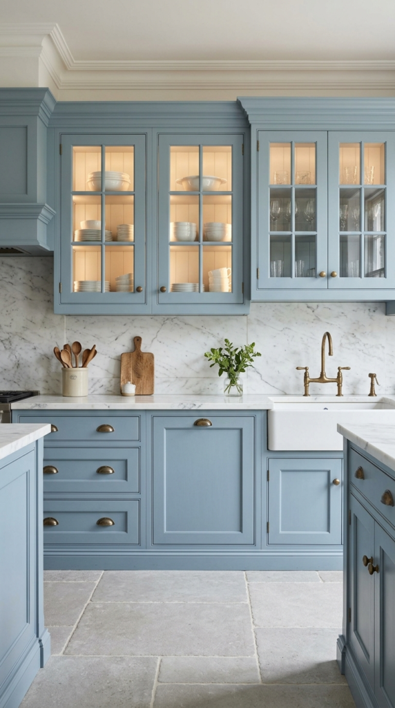
Closed doors hide beauty, while glass fronts show it off. Blue cabinets with glass panels turn everyday plates and glasses into part of the decor. Light passes through the panes, so the wall feels open instead of boxed in. That’s why many designers recommend this fix for kitchens where heavy upper cabinets make the room feel crowded. Dusty or slate blue pairs well with white dishware, creating a calm, curated look. Add a small interior light, and the display glows softly in the evening. The result is a kitchen that feels refined, personal, and gently dramatic.
Styling glass cabinets is easier than it looks. Stick to a simple palette of white, cream, or clear pieces so the blue stays the focus. Group items by height, place larger plates at the back, and leave a little breathing space between stacks. Even basic dishes look intentional when displayed with tidy repetition. Choose seeded or reeded glass if you prefer a softer view of the shelves. Antique brass knobs add a vintage finishing touch that feels warm against the cool paint. You’ll notice a kitchen that looks bright, organized, and full of quiet charm.
please also read: how high is a kitchen table
Powder Blue Retro Appliances
- Turns appliances into the main design feature
- Works as a color pop without painting anything
- Chrome details add a classic diner sparkle
- Checkerboard floors keep the retro mood balanced
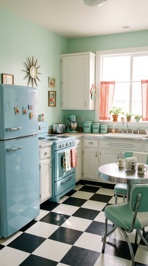
Who says appliances have to be boring? A powder-blue refrigerator instantly gives a kitchen personality, and you do not need to repaint a single wall. The soft shade feels nostalgic, cheerful, and surprisingly easy to live with. In my experience, one colorful appliance is enough to set the whole mood, especially when the cabinets stay white and simple. Chrome handles add a gentle sparkle that echoes classic diners. The room feels playful without looking crowded, and the color becomes the first thing guests notice. It is a fun way to bring vintage charm into a modern home.
Retro style works best when you keep the supporting details clean. Pair pale blue appliances with white cabinets, a checkerboard floor, and a few chrome accents. Add a small cafe table by the window, and the corner becomes a cozy breakfast nook. I’ve seen this work well in small kitchens, where one standout piece does the job of an entire decor scheme. Keep countertops light and avoid too many extra colors, so the blue stays the star. The finished look feels bright, happy, and full of character, like a kitchen from a favorite old movie.
Slate Blue Open Shelving
- Wood shelves pop beautifully against a muted blue wall
- Keeps everyday items within easy reach
- Plants and jars add life and texture
- Makes small kitchens feel lighter than heavy cabinets
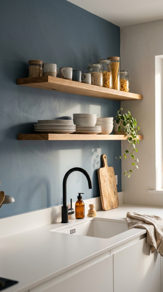
Open shelves look their best against a deep, muted wall. Slate blue creates a calm backdrop that makes white plates and wooden boards stand out, almost like a styled shop display. Without bulky upper cabinets, the kitchen feels lighter and more spacious. I’ve noticed that this setup also makes cooking easier, since your favorite bowls and jars stay within arm’s reach. A trailing plant or two adds a fresh, living touch that softens the straight lines. The result is a space that feels relaxed, practical, and beautifully lived in, with a clean Scandinavian charm that never feels cold.
Styling open shelves takes only a few simple habits. Keep to two or three materials, such as white ceramic, glass, and warm wood, so the shelves look calm rather than cluttered. Place taller items at the ends and lower stacks in the middle for balance. Leave small gaps so each piece can breathe. Natural oak or walnut brackets look especially rich against blue paint. That’s why many designers recommend this idea for small kitchens that need more openness. Add a soft side light, and the whole wall glows. The final look is airy, neat, and quietly stylish.
Teal Accent Wall
- Adds drama with just one can of paint
- Creates a defined dining zone in open layouts
- Mustard or brass accents make teal glow
- Low-cost update that feels bold and fresh
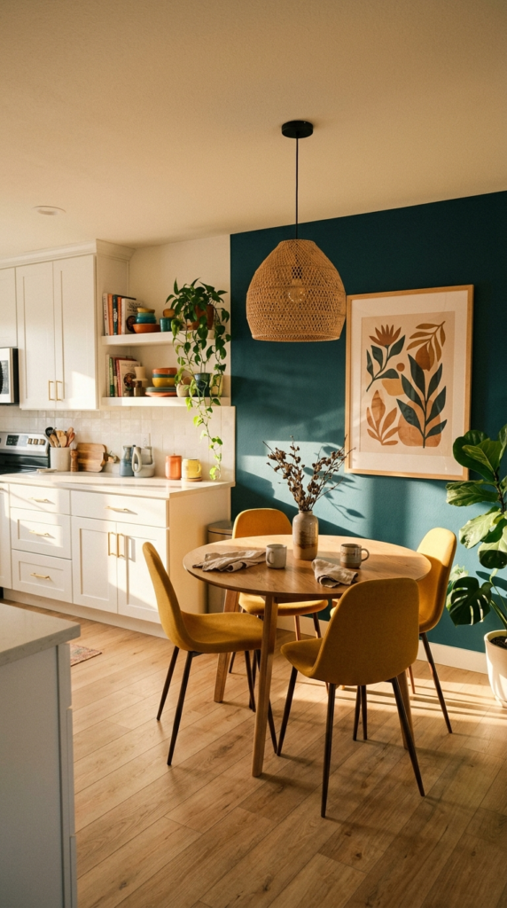
One painted wall can completely change the mood of a kitchen. Deep teal brings richness and energy, and it works especially well behind a dining table or breakfast nook. Because only one surface is painted, the room stays bright while still gaining real personality. In my experience, this is one of the most affordable ways to add bold color, and the transformation takes just a weekend. Pair the teal with white cabinets and warm wood so the shade feels balanced. Add a framed print or a mirror, and the wall becomes a polished backdrop that welcomes everyone to sit and stay.
Color pairing is where teal truly shines. Mustard chairs, brass lights, and natural wood tones all glow beautifully against it, creating a warm and layered look. Choose a matte or eggshell finish to hide wall flaws and avoid harsh glare. I’ve seen this work well in open-plan homes, where an accent wall quietly separates the dining area from the cooking zone. Keep the opposite walls light, so the room never feels dark. The final result is a cozy, confident corner that feels designed, inviting, and full of life from breakfast to late evening.
Coastal Breakfast Nook
- Turns a forgotten corner into a favorite spot
- Beadboard adds texture without clutter
- Bench storage hides linens and placemats
- Striped cushions bring a fresh coastal feel
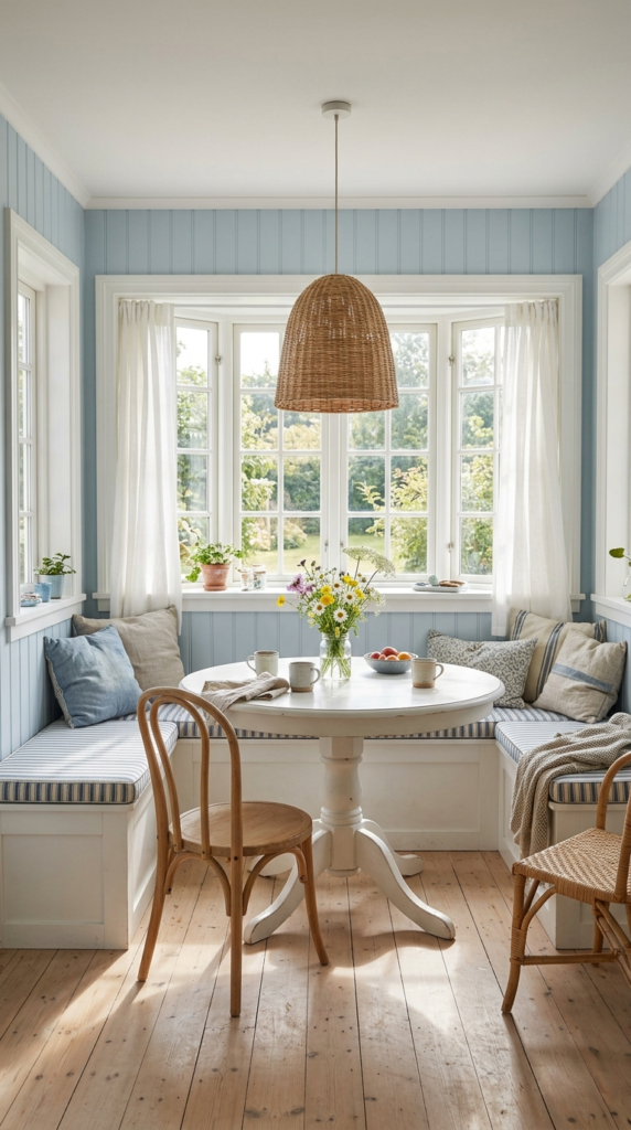
A sunny corner can feel like a mini vacation. Pale blue beadboard walls, a built-in white bench, and a round pedestal table turn a forgotten corner into the coziest spot in the house. The soft color keeps the nook bright, while the paneling adds texture without clutter. In my experience, families gather here more than at the main dining table, because the space feels intimate and relaxed. Add striped cushions for a fresh, coastal touch. Storage under the bench keeps placemats and linens hidden. The result is a charming retreat that makes everyday breakfast feel like a special occasion.
Want the nook to feel finished? Layer in a few simple details. Choose cushions in blue and white stripes, then add a woven pendant light above the table for warmth. Keep the tabletop clear except for a small vase of fresh flowers. I’ve noticed that a bay window makes this idea shine, since daylight bounces off the pale walls all morning. If you lack a window, a mirror or soft wall sconces can help. Light wood flooring completes the airy mood. The finished corner feels calm, welcoming, and perfect for slow coffee, homework, or weekend pancakes.
Navy Bar Stools
- Adds rich color without painting anything
- Velvet softens hard kitchen surfaces
- Brass legs add a subtle shine
- Easy to swap if your taste changes
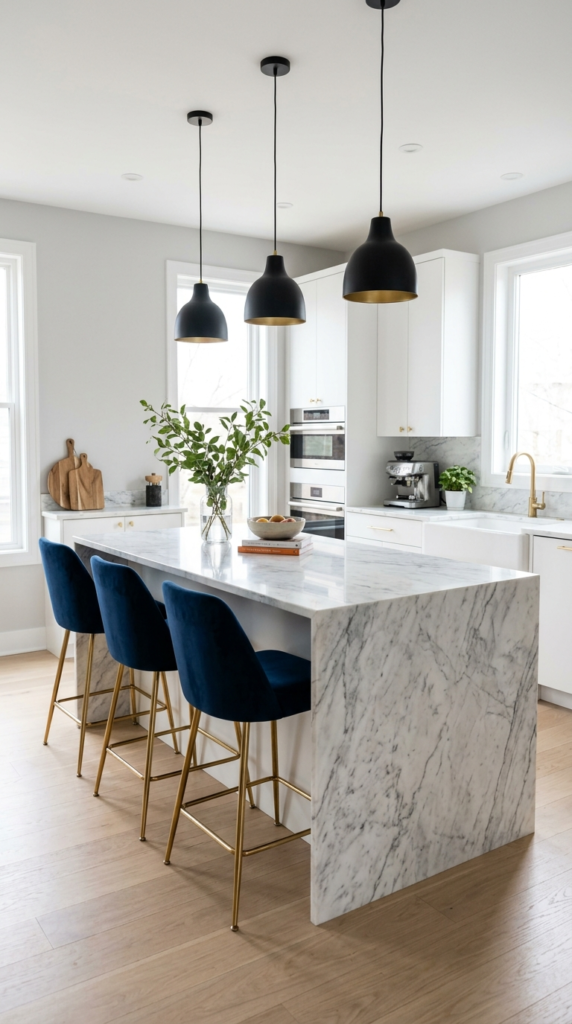
Small pieces can carry big color. If painting cabinets feels like too much, start with seating. Navy velvet stools beside a white marble island add richness and a pop of luxury. The fabric softens hard surfaces, while brass legs add a subtle shine. In my experience, stools are the easiest color commitment, because you can swap them in minutes if your taste shifts. They also pull the eye toward the island, creating a stylish gathering spot. Choose performance fabric for spills and sticky fingers. The result is a kitchen that feels warm, polished, and ready for company without renovation.
Choosing the right stool matters as much as the color. Pick a seat height around twenty-four inches for counters and thirty inches for bars, and leave about six inches between stools so everyone has elbow room. I’ve seen this work well with a low back, which keeps sightlines open across the room. Repeat the blue once more elsewhere, perhaps in a dish towel or a ceramic bowl, so the stools feel intentional. Matte black pendants above the island sharpen the look. The final effect is balanced, comfortable, and designed, with a color story that flows from seating to surroundings.
Brass Pendant Lights
- Warm metal balances cool blue tones
- Dome shades direct light onto work surfaces
- Adds a glow that deepens navy at night
- Brushed finishes avoid a flashy look
Lighting can make blue look completely different. Warm brass pendants hanging over a blue kitchen create a golden glow that deepens navy and softens teal after sunset. The metal adds a sparkle that paint alone cannot give. In my experience, this pairing is one of the most flattering combinations, because warm and cool tones balance each other. Dome shades direct light downward onto counters, which keeps your workspace bright and practical. Choose an aged or brushed finish to avoid a flashy look. The result is a kitchen that feels layered, elegant, and inviting from the moment you flip the switch.
Placement matters just as much as the fixture. Hang pendants about thirty inches above the counter so the light feels intimate without blocking views. Space them evenly, roughly a fixture-width apart, for a tidy rhythm. I’ve noticed that a dimmer switch is the secret upgrade, letting you move from bright cooking light to soft dinner ambience in seconds. Repeat the brass in cabinet pulls or a faucet so the lighting feels connected to the room. Keep surrounding surfaces light, and the glow bounces beautifully. The finished look is warm, polished, and quietly dramatic, especially in the evening
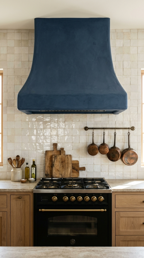
Sculpted Range Hood
- Turns a functional feature into a focal point
- Small footprint with a big visual payoff
- Copper and wood add warmth nearby
- Perfect for people nervous about large areas of color
Look up, and let the hood take the spotlight. A deep blue range hood turns a purely functional feature into a sculptural centerpiece. Plaster or painted wood versions look especially soft and handcrafted. Surrounded by white tile and warm wood, the color stands out without overwhelming the room. In my experience, this is the perfect idea for people who love blue but are nervous about painting large areas. It covers a small footprint yet delivers a big visual payoff. Copper pots and wooden boards nearby add warmth and character. The finished kitchen feels rustic, refined, and full of personality.
Hoods come in many finishes, so choose one that suits your style. Matte plaster feels organic and calm, while glossy lacquer looks sleek and modern. I’ve seen this work well when the hood matches the lower cabinets or island, tying the whole room together. Keep the wall behind it simple, such as white tile or limewash, so the shape remains clear. A brass trim line adds a tailored detail. Always check that the vent power suits your cooktop, because beauty should never replace performance. The result is a kitchen where the stove area looks intentional, stylish, and quietly impressive.
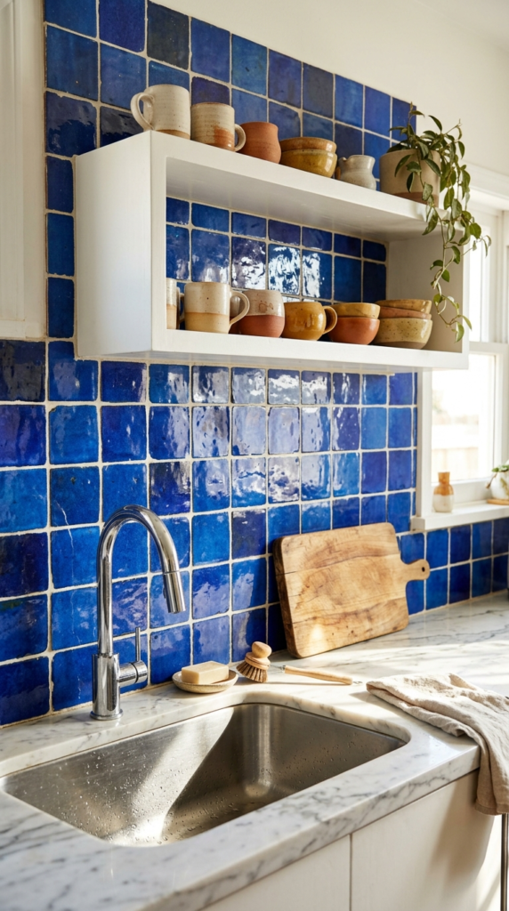
Handmade Cobalt Tile
- Shade variation gives the wall movement and depth
- Glossy glaze wipes clean behind the sink
- One tiled wall is enough for a big change
- Imperfect tiles feel more charming than uniform ones
Handmade tile brings a richness that flat paint cannot match. Cobalt tiles with slight shade variation catch light like water, giving the wall movement and depth. Placed behind the sink or stove, they become a bold artwork that still serves a practical purpose. In my experience, imperfect, uneven glazes feel more charming than perfectly uniform ones, because every tile looks unique. Pair them with white counters and natural wood to keep the look fresh. A single tiled wall is enough to give the whole room a sunny, Mediterranean feel without needing a full renovation or a big budget.
Choosing tile is easier when you follow a few simple rules. Start with a small sample and view it in your own light, since blue can shift from sky to navy between morning and evening. Select a lighter grout for a crisp look or a matching grout for a soft, seamless finish. I’ve noticed that glossy surfaces wipe clean quickly, which is a real bonus behind a sink. Keep nearby accessories simple, such as white mugs and wooden boards. The finished wall feels lively, artisan, and welcoming, adding vibrant color exactly where you spend the most time.
Sky Blue Ceiling
- Adds color without touching cabinets or walls
- Makes the room feel taller and brighter
- Pairs beautifully with white walls and wood beams
- A budget-friendly weekend project
The most overlooked surface in the kitchen is right above your head. A soft sky-blue ceiling adds color without touching cabinets or walls, and it lifts the whole room like a bright, open sky. Southern porches have used this trick for generations, and it works just as well indoors. In my experience, guests rarely guess why the room feels so cheerful until they glance up. Pair it with white walls and warm wood beams for a clean, cottage-inspired look. The soft shade reflects daylight gently, so the space feels taller, calmer, and wonderfully fresh throughout the day.
Painting a ceiling is simple when you plan ahead. Choose a flat or matte finish to hide imperfections, and pick a shade one or two steps lighter than you think you need, since overhead color looks deeper once it is up. I’ve noticed that pale blue works best in rooms with plenty of natural light, while smaller, darker kitchens may prefer a whisper of grey-blue. Keep trim and walls crisp white for contrast. That’s why many designers recommend this idea as a budget-friendly refresh. The final effect is subtle, delightful, and full of quiet charm.

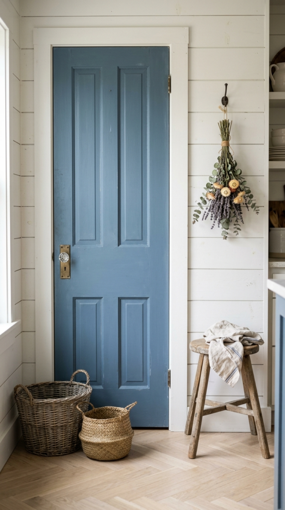
Denim Pantry Door
- Almost no cost, just a quart of paint
- Draws attention to the pantry in a pretty way
- Glass knobs add a vintage touch
- Ideal starter project for color-shy homeowners
A door can be a design feature, not just an entrance. Painting a pantry door denim blue gives the kitchen a charming accent with almost no cost. White shiplap walls make the color pop, while a glass knob adds a vintage touch. In my experience, this is the ideal starter project for anyone who wants color but hesitates to commit. A quart of paint and a weekend are usually enough. It also draws attention to the pantry in a pretty way, turning a plain storage space into a welcoming feature that guests notice right away.
Styling the area around the door finishes the look. Place woven baskets beside it for extra storage, and add a small wooden stool with a folded linen towel for a lived-in feel. Hang dried flowers or a simple wreath for softness. I’ve seen this work well in older homes, where a painted door adds character without major changes. Use satin paint, since it resists fingerprints and wipes clean easily. Keep hardware simple, such as glass or aged brass. The final result is a tidy, cozy corner that feels farmhouse-inspired, personal, and beautifully practical.
Blue Textile Layers
- Renter-friendly color with zero construction
- Easy to swap with the seasons
- Natural fibers handle frequent washing
- Mixed stripes and checks add layered charm
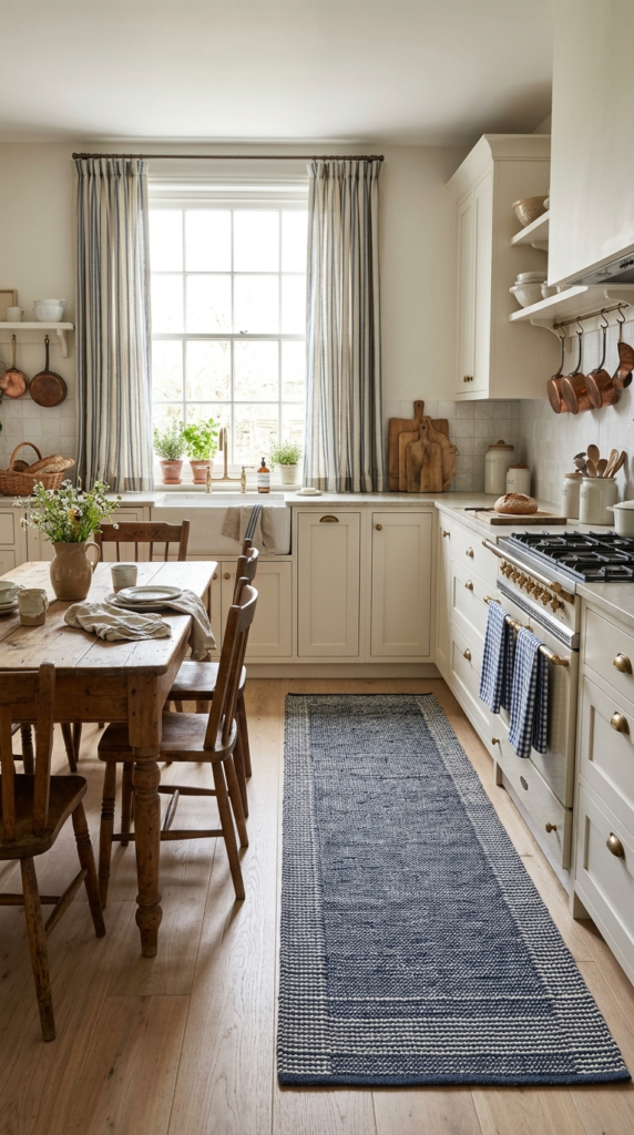
Not every kitchen needs a renovation to feel blue. Textiles do the heavy lifting with zero construction. Striped linen curtains, a woven runner, and gingham dish towels bring color in soft, layered ways. In my experience, this is the perfect idea for renters and anyone who loves to change styles with the seasons. Everything can be swapped in minutes, and the cost stays low. Against white cabinets and light wood, these fabrics feel relaxed and effortlessly French-country. The kitchen gains warmth, texture, and a lived-in charm that makes the space feel friendly the moment someone walks through the door.
Mixing patterns is easier than it looks. Choose one stripe, one check, and one solid, and keep them all within the same blue range. I’ve noticed that varying the scale, such as wide stripes with small gingham, adds interest without chaos. Natural fibers like linen and cotton hold up well to washing, which matters in a busy kitchen. Add linen napkins on a wooden table for a finishing touch. A runner in front of the sink also protects your feet and floors. The finished look is cozy, layered, and inviting, like a kitchen that has been loved for years.
Blue and White Ceramics
- A finishing touch that makes the room feel personal
- Collect one piece at a time for a curated look
- Groups in odd numbers look styled without effort
- Thrift finds work as well as new pieces
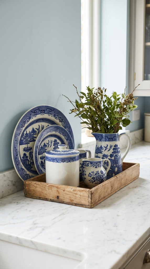
Finish the room with the details people remember. Blue and white ceramics have charmed homes for centuries, and they still look fresh today. A few pitchers, a large canister, and hand-painted plates leaning against the wall can finish a blue kitchen better than any expensive accessory. In my experience, collecting a piece at a time feels more personal than buying a matching set. Thrift shops and flea markets hide lovely finds. Group items in odd numbers on a wooden tray, and the counter looks styled without effort. The result is timeless, curated, and full of stories.
Display matters as much as the pieces themselves. Place a tall pitcher at the back, a medium bowl in front, and a small dish in the foreground for a pleasing, layered rhythm. I’ve seen this work well on counters, open shelves, and even the top of the fridge. Keep the background simple, such as pale blue paint or white tile, so the patterns do not compete. Use pieces daily when you can, since a kitchen that is used looks warmer than one that is staged. The finished look feels charming, personal, and joyfully balanced.
Conclusion
Your dream kitchen may only be a few brushstrokes or one beautiful tile away. From soft powder shades to bold navy statements, each idea shows how blue can bring calm, depth, and charm to everyday cooking spaces. I’ve seen how small changes like these can completely transform a room, and you never have to start big. Whether you’re planning a full blue kitchen makeover or just a simple weekend refresh, choose the look that feels like you. Save this post on Pinterest so you can return anytime. Try one idea soon, and share it with a friend who loves home inspiration. Your brightest kitchen starts here.